Minerva Studio - Fotolia
What's the purpose of a Gantt chart for large-scale projects?
A Gantt chart's selling point is that it's simple to understand at a glance. But a large-scale project, such as a DevOps transformation, quickly turns that advantage into a flaw.
A Gantt chart is a communication and feedback tool that helps visualize project progress. These bar charts display progress horizontally as a simple guide to what needs to happen when, and who will do it. When a director or a project manager creates a Gantt chart, they can set expectations for and course-correct a project's direction, fill in details and compare priorities.
A Gantt chart neatly encapsulates a project with limited scope. Some teams use Gantt charts for large-scale projects, such as a DevOps transformation -- but they tell an incomplete story. Let's get into the good, the bad and the ugly of Gantt charts.
Gantt chart benefits
An elementary Gantt chart fails to define some important project details, but it does provide organizations with certain benefits. Here are four reasons why a Gantt chart is beneficial for a large-scale project.
Create a vision for your project. A Gantt chart conveys the project's roadmap in one look, as well as the who, what, when and how of the work.
A Gantt chart can convey tasks with their related deadlines -- all to help achieve important business goals. A vision and roadmap for this project should run across teams -- maybe even departments. The Gantt chart user should immediately know whether a phase, such as Phase III in the DevOps transformation project example, is incomplete.
Balance priorities. Gantt charts help teams figure out to how juggle multiple items, without missing due dates. The organization might find Gantt charts useful to predict the number of sprints necessary to accomplish development and infrastructure work.
Even one day late on a deliverable can drastically reshape a large-scale project. Gantt charts help a team visualize the consequences of work that's late. They facilitate conversations about priorities and deadlines.
Time spent on one area means less time for another -- it requires balance to succeed. Place Gantt charts on the wall to spark open and organic conversation about the project, rather than scrambling to address problems late with the wrong resources.
Find what's missing from the vision. It's hard to create a Gantt chart for large, multi-faceted projects. Software testers, architects, programmers and other IT professionals will find many items missing from a simple Gantt chart. Rely on these specialists to identify and implement more thorough plans.
Enforce team direction. A good Gantt chart provides a coherent plan. But even a terrible Gantt chart forces conversations that clarify roles and responsibilities.
A few years ago, I consulted with a company that championed adoption of continuous delivery, but it lacked a fleshed-out plan. When I interviewed members of the architecture group, they said it wasn't realistic to expect to fit API or enterprise service bus tools in Docker container components. When I asked what they would have in 18 months, the software architects said, "We'll have to see what the dev teams do," and shrugged their shoulders.
The higher-ups demoted that group's director within a month. A Gantt chart might have forced that architecture group to be proactive with their work, instead of reactive.
What a Gantt chart won't show you
The purpose of a Gantt chart is to provide a high-level view of how and when work must get done. But that strength is also its weakness, as it leaves a lot up to interpretation and opens the door for delay.
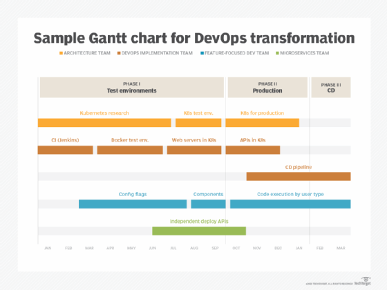
Let's say an organization wants to embark on a DevOps initiative to modernize its large, monolithic web apps. The organization might find Gantt charts useful to organize multiple teams and departments, as well as set goals and deadlines. But a project with that large of a scope is difficult to chart -- take the example of this DevOps transformation:

While a Gantt chart is designed to give a rough outline of the project schedule, it often over-simplifies the work to be done. If a Gantt chart is the sole visualization of a team's projected work, expect the project to stray from the plan. Labels, like CD pipeline, probably aren't well defined. Meanwhile, the feature-focused dev teams will likely prioritize work with clearer expectations or sooner deadlines -- or they might wait for architecture work on Components or Independent deploy APIs to be completed. Meanwhile, as teams quibble over this mess of dependencies between their tasks, QA engineers will laugh and turn away from the all the finger-pointing.
Thus, Gantt charts alone do a poor job of visualizing work in progress for large projects. Instead, consider the purpose of a Gantt chart to be a simple timeline that is easy for anyone in the business to read.
How PERT charts, Kanban clarify workflows
PERT stands for Program Evaluation and Review Technique. Unlike Gantt charts, PERT charts clearly identify dependencies between components of the overall project.
A PERT chart shows dependencies, such as whether a development team must fully complete a task before an architecture team can start on its own task. PERT charts connect deliverables with arrows between each other, making work relationships apparent.
Because a PERT chart clarifies which department depends on another, it can prevent some finger-pointing about missed deadlines. All teams understand where their responsibilities lie in a massive organizational undertaking. If a misunderstanding arises, a PERT chart prompts a conversation at the appropriate level. The PERT chart also helps management understand the critical path -- which groups are at risk for project delays at a given time.
Scrum and the Scaled Agile Framework recommend that organizations use a Kanban board as a visualization of work at the team level. The physical visualization of Kanban boards involves cards -- usually in the form of sticky notes -- that detail tasks, advancing left to right through different stages of a workflow as they near completion.
Unlike a Gantt chart, Kanban boards are designed to evolve with a project, enabling some work items to move or be expedited in favor of others. To visualize dependencies in a Kanban board, a team can stack cards on top of one another, or detail sub-tasks for each card. However, Kanban boards often fail to visualize strict deadlines, which makes each type of project planning chart useful for different purposes.


