
Rawpixel.com - stock.adobe.com
Using Visual Analytics, Big Data Dashboards for Healthcare Insights
Visual analytics and big data dashboards can provide valuable insights to healthcare organizations - if they follow some important guidelines.
The need to make sense of big data is quickly becoming an imperative in the healthcare industry, demanding a degree of time, skill, attention, and resources that many providers simply do not have to spare.
While changing payment models are putting pressure on clinicians to have instant access to actionable information about their patients, their performance, and their potential to close lingering gaps in care, many electronic health records and business intelligence systems are still struggling to deliver at-a-glance insights that could potentially revolutionize the way providers work.
There are any number of contributing factors to this dearth of meaningful clinical intelligence available at the point of care. Poor data integrity and governance, a lack of technical interoperability, and challenges with privacy and security all converge to create one of the biggest overarching problems in the healthcare industry: big data simply isn’t very usable yet.
Much of the big picture work that needs to be done will require heavy duty, long-term investment in the development of shared data standards and a complete restatement of the business case for health information exchange.
But there is plenty that can be accomplished a little bit closer to home in order to make existing datasets more accessible, appealing, and useful for day-to-day decisions that impact patient outcomes and business sustainability.
Improved visual analytics capabilities and better big data dashboards can be an invaluable addition to both the executive toolkit and the clinical arsenal.
Visualizations can make complex datasets clear in an instant by presenting information in intuitive and user-friendly ways, opening up the chance to dive deeply into existing data assets and unveil novel insights into opportunities for improvement.
“We have a lot of data. There’s just so much of it,” said Sanket Shah, Director of Client Management at Blue Health Intelligence, which is an independent licensee of the Blue Cross Blue Shield Association.
“We have all of these disparate sources coming together, and leaders want to know how they use that to figure out why something is happening, what to do about it, and what to expect in the future.”
“You can only get those answers by getting your hands on the actual data – and you can only understand it when it’s presented in a human-readable way,” said Shah, who is also a Professor of Health Informatics at the University of Illinois at Chicago. “Much of the time, unless you’re a highly trained data analyst, a visualization is the best way to make data comprehensible to the end user.”
Using visual analytics to accelerate the democratization of data
Healthcare organizations have started to develop an unquenchable thirst for insights, which is becoming just as strong in the board room as it is in the clinic.
Executive leaders are becoming much more data-savvy as organizations actively seek out C-suite candidates with proven analytics skills to support their strategic goals.
Even back in 2015, a Black Book poll of more than 1500 healthcare stakeholders found that 83 percent of hospitals expected their CEOs, CFOs, CNOs, and CMOs to have successful health IT implementations on their resume.
Big data analytics skills featured prominently in job ads at the time – and organizations were ready and willing to poach experienced candidates from other industries to satisfy their need to develop a data-driven culture from the top down.
That desire has intensified over the past two years, especially with the rapid growth of value-based reimbursements.
“We’re seeing a lot more executives clamoring for detailed data so they can get to the root cause of why certain things are happening in the organization,” explained Shah.
“Executives have the time and the ability to understand more sophisticated data. They want to know what the metrics mean and how they relate to outcomes – and how to fix the issues so that they can keep more revenue within their walls while meeting the quality benchmarks that have become so important for all stakeholders.”
Value-based care requires organizations to democratize access to actionable insights by driving information through the entire enterprise.
In a collaborative, outcomes-driven environment, all members of a patient’s care team – and those directing the team’s activities – must have speedy and reliable access to clinical and financial intelligence to illuminate the best possible course forward.
Many would argue that clinicians’ primary interface – the electronic health record – still does a poor job of allowing users to interact with data in an intuitive and impactful manner.
But an enhanced focus on creating visualizations that reduce the cognitive burden of scrolling through endless lines of black-and-white lab results or poorly formatted continuity of care documents could drastically improve the ability of providers to make informed choices at the point of care.
That is because many of healthcare’s stories are just too complex to tell adequately with spreadsheets and tables, asserted Steve Davis, Health Research and Policy Writer at Deloitte.
“Getting through so much raw data is extremely difficult, especially for someone who isn’t trained to see the patterns,” he said. “Cleaning the data and presenting it in a visually meaningful manner makes it a lot easier to sift through large volumes of information.”
Visualizations also make it easier to avoid some of the very common traps of data misinterpretation, added Peter Viechnicki, Strategic Analytics Manager and Data Scientist at Deloitte.
“Data that applies easily to one segment of the population might not be applicable at all to another. It could be misleading,” he explained. “It could be filled with caveats. In healthcare, we see a lot of things that look like trends but that might just be correlations without provable causation.”
“For developers, the trick is how to represent those visually without implying something that you don’t mean to convey.”
Visualizing public data sets to make strategic population health decisions
Creating a valuable visualization is a two-part effort. First the data feeding the chart, graph, or interactive dashboard must be timely, detailed, and wholly reliable.
Secondly, the end product should meet Viechnicki’s criteria: it must present the information in a clear, appealing, and intuitive manner while adhering to best practices in informatics and data science.
These rules apply to visualizations that rely on public datasets, like CMS spending trends, as well as an organization’s internal assets.
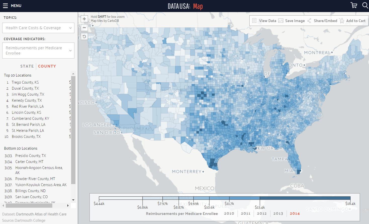
DataUSA, an online public health dashboard created by Deloitte and the MIT MediaLab, visualizes more than 100 key socioeconomic determinants of health, including education and poverty rates, insurance coverage rates and care costs, and housing issues.
Using an interactive map of the United States, the tool provides an instantly accessible way to visualize data from both a high level and a county-by-county perspective.
Certain data for more than 2300 public use microdata areas (PUMAs), which range from New York City neighborhoods to rural counties in Arkansas and West Virginia, is also included.
“For Medicare spending data, you need to be able to get down to the county level because there are so many variations in unexpected places,” said Viechnicki. “It’s tough to figure out why one county might have a huge spike in costs, but the neighboring one doesn’t.”
“It’s even tougher if you don’t have a visualization that lets you see that the more expensive county is all controlled by one hospital system, but that organization has a great deal more competition in the next region over.”
In addition to providing access to the data online, DataUSA allows users to go “shopping” for pre-curated elements that can be integrated into other applications, websites, or dashboards, said Viechnicki.
“We have a feature that allows you to pick a few variables, put them in a shopping cart, and download them in a usable [CSV] file format,” he said.
“That will let users come up with their own hypotheses and test them using validated data, which is exactly what open data is all about. It’s meant to power analytics for users who don’t necessarily have the software or skills to go hunting for good data by themselves, so they don’t have to worry about completing that step first.”
Maps are an optimal entry point into data visualization for those who are interested in understanding local or regional population health trends, but who may not have the skills of a trained analyst, agrees Marc Gourevitch, MD, MPH, Chair of the Department of Population Health at NYU Langone Medical Center.
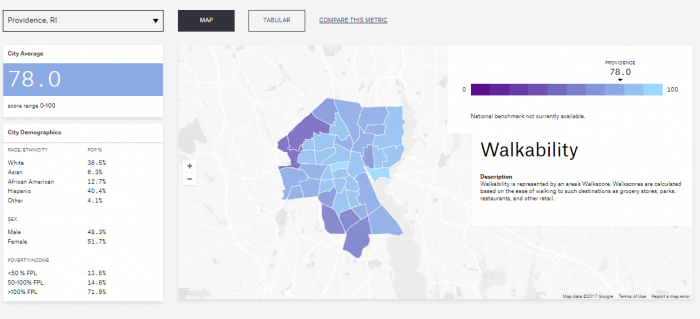
Gourevitch and a small group of colleagues from NYU and the National Resource Networks have created the City Health Dashboard to pinpoint public health needs down to the neighborhood level.
With data for 500 of the largest US cities in development, the tool also uses geography to let users explore social determinants and health behaviors, including smoking rates, opioid deaths, housing affordability, poverty rates, the built environment, and unemployment levels.
“Although familiarity with traditional paper-based mapping has dropped a lot, the availability of GPS and Google Maps has become so widespread that users can instantly recognize the shape of their communities and the landmarks within them,” said Gourevitch.
“A depiction of the outlines of a city divided by neighborhoods or census tracks, it immediately jumps out at the viewer. The meaning of a darker shaded color versus a lighter one is intuitively apparent.”
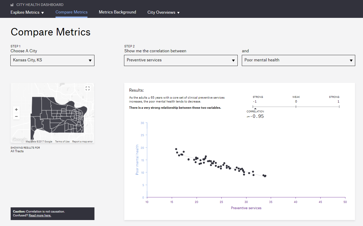
City Health Dashboard users can also create custom charts comparing two metrics, such as the availability of preventive health services and the number of residents with poor mental health.
The function also includes an important little warning box reiterating the golden rule of data science: correlation is not causation. Clicking on the warning gives users access to more information on how to correctly interpret the analytics presented.
“Community planners need to know where to get the most bang for their buck, because they are often operating under financial constraints that require them to be very judicious about how they allocate their resources,” said Gourevitch.
“Obtaining public data sets in the first place is not always easy, and then calculating the values at the city or neighborhood level is an additional challenge. By displaying the data visually, we think that it will more quickly bring to life the needs that are specific to communities and the gaps in health across communities in a way that simple tabular representation fails to do as effectively.”
Public datasets don’t always have to be based on maps to be visually striking and convey their meaning quickly.
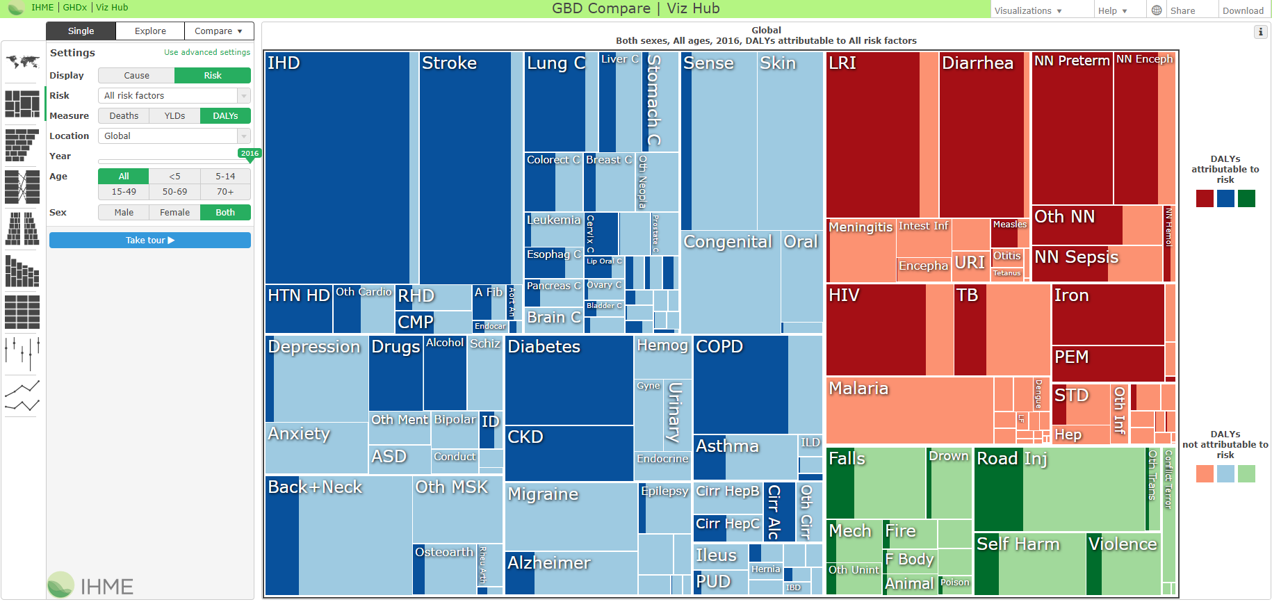
The Institute for Health Metrics and Evaluation (IHME) and the University of Washington keep an online library of public data visualizations in a colorful variety of chart and graph styles.
The tools display US and global public health data, tracking changes in risk and incidence of key community health indicators, mortality rates, and spending over time.
All of the tools are highly interactive, allowing users to explore data in different formats, dive down into the details of specific metrics, and access metadata to clarify how each result was generated.
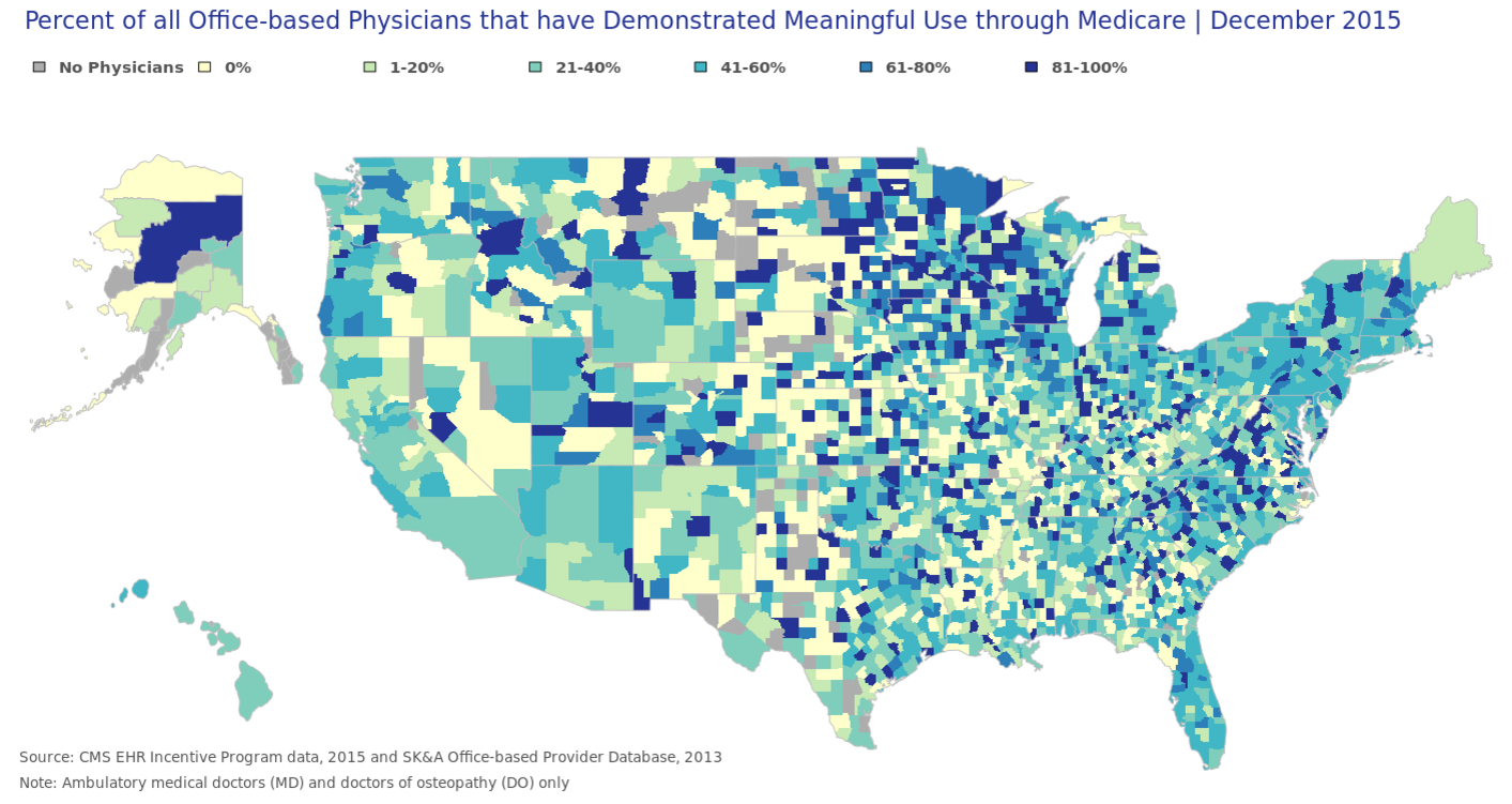
The Office of the National Coordinator (ONC), and other various agencies within the Department of Health and Human Services also routinely publish charts, graphs, and maps that illustrate health IT adoption rates, provider capabilities, public health disparities to keep industry stakeholders informed of the accomplishments of their peers.
The ONC’s Health IT Dashboard is a small catalogue of interactive applications covering EHR adoption, state health IT policies, meaningful use attestation, and interoperability.
While the applications often lag a few years behind due to the scarce availability of current public health data, they provide useful snapshots of key metrics related to achieving the Triple Aim: lower costs, improved population health, and better individual outcomes.
Leveraging data visualizations within the healthcare organization
Public health datasets are important for taking a birds-eye view of a community or broad patient population, but few provider organizations can implement actionable improvements without examining the clinical, administrative, and financial data held within its own walls.
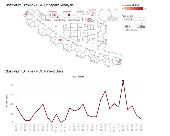
At Augusta Health, a community hospital in Virginia, a combination of microbiology data and geospatial analysis is helping to identify patterns in multi-drug resistant organism (MDRO) infections among patients.
After a cluster of C. difficile infections were attributed to a single patient who spent weeks in the ICU walking around the unit as part of her recovery, Decision Support Manager Penny Cooper, DHSc, started work on a visualization tool that could use hospital floor plans to accurately track the timing and spread of hospital-acquired infections.
“We used images of the hospital floor plan imported into Tableau, then we geocoded the locations of the patient rooms on top of that using XY coordinates on those images, so it looks like the rooms correspond to the floor plan,” Cooper explained.
“Then we incorporate the positive organisms, the date, and all of the rooms the individual was in – they might move from the ICU to a step-down unit before they might be discharged from our 3 East medical unit – so you would see the time period that they spent in each one of those locations.”
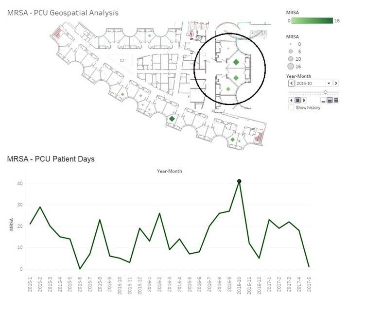
Using different color intensity and marker sizes to indicate higher or lower numbers of infections, the tool has the potential to illuminate hidden patterns in infection rates that may end up altering the way the organization approaches some of its patient safety strategies.
“One of the most common rooms for MDRO infections is the first one to the right when you enter the ICU ward,” noted Augusta Health Chief Medical Officer Dr. Richard Embrey. “Is this because environmental services cleans that room first and unknowingly brings something in there that stays there or spreads it to other locations when they pick up the trash there first?
“Once we understand those patterns, we can work with our infection prevention experts to say, for example, that we need to be sure to use ultraviolent cleaning techniques in these rooms, or spend extra time making sure that room to the right of the entrance is receiving a little extra monitoring.”
While the visualization is not yet being used in daily practice, “we know it has enormous promise for looking at the spread of infection over time,” Embrey asserted.
Further enhancements may include the integration of room-by-room hand hygiene observations, added Cooper, which will increase the granularity of the data.
“Right now we do those observations by unit, for the most part,” she said. “But if we can add that layer of visualization to the infection images for each room, we will be able to clearly see how hand hygiene, or the lack thereof, correlates with infection rates.”
“It’s one thing to look at a box on a spreadsheet that says ‘this unit had 12 infections last year,’ but it’s another thing entirely to see a visual representation of where those infections occurred, how close they were to each other, and how the physical environment contributes to these patterns.”
Deploying best practices for data visualization development
While extracting, normalizing, and analyzing big datasets tends to be a lengthy and complex process for most healthcare organizations, turning the scrubbed up data into an attractive visualization isn’t always quite as arduous, said Cooper.
“Don’t be intimidated by the thought of creating a visual version of your data,” she advised. “Our infection rate dashboard was very easy to create. We started the project in Microsoft Access, because it had all the elements we needed to put something together. You don’t need some sort of expensive specialty software to build a good visualization. It can be very simple.”
Other experts agree that simplicity, both on the back end and in the finished product, is at the heart of every quality visualization.
“The most effective dashboards are the ones that are direct and to the point,” stated Shah. “They’re not over seasoned with aesthetics. The user needs to understand what they’re looking at without being overwhelmed with too many bells and whistles that are only there for visual effect.”
“You have limited real estate and you want to be sure that you are presenting the right content so that the end user can make a decision based on what they’re seeing.”
Viechnicki from Data USA expressed the same sentiment.
“Simplicity is really key,” he said. “When we first designed the site, we put a lot of really complex visualizations in it. But after working with our partners from the MIT Media Lab, we changed our approach.”
“They had created some similar sites before, and they had learned that the most effective charts are very simple. A bar chart with two or three data points is very accessible if you want people to absorb information quickly, for example, and then act on it. It may not capture all the details and complexities of a situation on the surface, but you might not need to do that for every visualization.”
Shah suggests focusing on creating a clean, easy-to-navigate visualization that conveys all the important information at a glance, but also includes accessible options for drilling down into the data.
“If you have a chart showing that your readmission rate is up 2 percent, a lot of your end users are going to want to find out why,” he noted.
“You don’t have to put all that data on the main display, but give them a drop-down. Let them click through to a more detailed breakdown of the data, or a different chart that gives them more insight.”
Dashboards, especially those geared towards providing insights for concrete decision-making, are supposed to be interactive, he added.
“For the best results, you should make the dashboard an informational hub, not just a flat display that leaves people asking more questions instead of getting the answers they need,” he said.
All of the data, whether on the front page or several clicks in, must adhere to commonly accepted rules of data display.
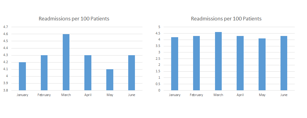
Units and scales must remain consistent throughout individual charts and any other visualizations using the same data set. Units should start at zero, where appropriate, and should not skip numbers.
Bars, slopes, or other elements used to compare two or more datasets should not be manipulated to show exaggerated differences between values, nor should inconvenient outliers be omitted unless there is a justifiable statistical reason for doing so.
Vertical and horizontal axes, titles, legends, and all other data elements should be labeled clearly on the visualization or with an accompanying key. If the visualization uses colors or gradations, they should be distinct and consistent.
“More and more users are able to pick up on those subtle tweaks that are often used to skew the viewer’s opinion one way or another,” Shah said. “Inconsistencies aren’t going unnoticed. Visual tricks aren’t going to pass muster.”
“If you create poor illustrations, you erode the trust in the data, even if the data itself is perfectly accurate. The visualization has to be trustworthy, because that is how the user is engaging with the underlying information.”
While organizations should not waste too much time on flashy animations or interactive features developers should pay attention to the fundamental aesthetics of fonts, colors, and spacing.
“Time is money, and you don’t want your user sitting there for hours waiting for all the bubble graphs on your dashboard to pop up, but it’s very important to consider basic elements of design consistency when you offer up a presentation,” said Shah.
“A really poor user experience will distract from the data, even if the numbers themselves are presented appropriately. The focus should always be the data. The visualization is there purely to make the data easier to consume.”
As healthcare organizations become more reliant on their big data assets to make decisions about patient outcomes and financial strategies, good data visualization habits will become increasingly crucial for ensuring that information is interpreted and utilized appropriately.
Creating striking, engaging, and meaningful data visualizations can help to break down even the most complex and convoluted healthcare problems into manageable component parts, giving providers a new level of insight into how to deliver the highest quality care to patients while succeeding with their strategic goals.


