
Sergey Nivens - Fotolia
Tableau or Qlik: What separates the data visualization tools?
While leading data visualization vendors Tableau and Qlik may seem similar, there are substantial differences. Understanding the differences is key to making the right decision.

Data visualization tools have grown in popularity over established BI tools because they offer interactive data visualization capabilities. These capabilities make it easier to communicate important relationships across the company. And two vendors -- Tableau and Qlik -- currently lead the market in data visualization. So, it's important to decide whether Tableau or Qlik is the better choice for your enterprise.
Tableau and Qlik have approached the visual analytics field from different angles, and that's reflected in how businesses use them to get the most value, said Alex Paretski, knowledge manager at Itransition, a software development company. Tableau can be a good fit for companies that look for visualized reports made by business users. Qlik tools are necessary for sophisticated data analytics, coupled with broad integration and customization capabilities.
"In data visualization, kudos often goes to Tableau due to its more compelling UI and versatile dashboards," Paretski said. Tableau is relatively easy to set up and use, even for business users who lack tech skills. And, because Tableau was initially brought to the market as a visualization tool, it excels in this area. After Salesforce acquired the company, many expect it'll take a new turn in the platform's development, particularly by advancing AI and machine learning capabilities.
Both of the primary products from Qlik -- QlikView and Qlik Sense -- bring together complex data analytics and visualization. These give users a set of tools for the data processing required to transform data into the appropriate form for different types of analytics. Qlik holds a leading position with enterprises that deal with big data that's steadily fed from scattered sources, Paretski noted. And Qlik is known to be more flexible when it comes to creating custom visualizations from scratch, which is sometimes impossible in Tableau.
Different paths on the data visualization journey
"The biggest difference between Tableau and Qlik isn't in the types of visualizations offered, but how you get there," said Evan Ankney, owner of Sportsbook Scout, a sports analytics service. In his experience, Tableau starts with the data in mind; Qlik starts with the chart. Both offer a similar menu of data visualizations.
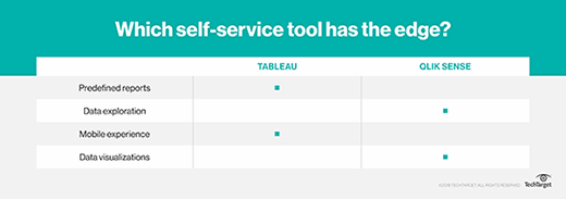
Tableau generally has a simpler interface for tying together data visualizations. And the only major data visualization that Tableau offers natively that QlikView lacks is the flow chart/Sankey diagram. Tableau also has an advantage over Qlik with regard to formatting. Tableau lets users specifically design dashboard layouts differently for mobile versus desktop use cases, Ankney said.
In addition, Tableau makes it easier to explore dimensions and measures as a starting point for building visualizations. Dimensions are used for categorical data, like dates, while measures are used for numbers. Combining the rows/columns concept with dimensions/measures makes Tableau a great option for data exploration.
"You aren't locked into a certain graph type and can easily manipulate things to show different views," Ankney said. "It is great when you know the data you want to display but might not know the perfect visualization for it. There are also endless customizations you can make to display exactly what you want."
Qlik starts with the chart type and is pretty straightforward. If you know what you want to display, Qlik makes it quick and easy to do it. However, because you have to manually switch chart types to experiment, there isn't as much flexibility on the exploration side, Ankney added.
Handling data entities in the Tableau or Qlik quandary
According to Cheryl To, data scientist on the data acquisition team at data integration tool vendor ThinkData Works, Tableau shines in terms of its rich assortment of prebuilt charts and graphs that can be linked easily on an interactive dashboard. ThinkData Works keeps Tableau in its toolkit for three reasons:
- It has extensive out-of-the-box features.
- It requires little to no coding for straightforward dashboards, which enables quick turnaround for client products.
- It integrates with any database on the market.
To create charts in Tableau, you only need to drag and drop variables into a workspace. And, to create dashboards, you just need to drag and drop charts into your desired location on the dashboard. "This drag-and-drop function means that building dashboards often requires little to no code, making the tool accessible to a wide range of audiences," To said.
Tableau does require some coding to create new data columns on the fly or when you want to build custom queries or functions. This syntax is similar to SQL, so there isn't a huge learning curve, To noted. And it is relatively easy to integrate with many of the databases on the market.
However, Tableau falls short in building diagrams to depict relationships, such as node-link, tree and Sankey diagrams, To added. Depicting relationships is important for understanding the flows of products, people and behavior and enables you visualize hierarchies in a business problem.
You can hand-code these in, but that requires additional data preparation. And the resulting visualizations can be less than ideal. "The resulting visualization is often less visually appealing than if you had built the visualization using a scripting language, albeit expending similar amounts of effort," To said.
Geospatial analytics can also be tricky in Tableau, especially when the final product requires that both point coordinates and polygon geometries are plotted on top of one another. Plotting multiple geographical layers in Tableau isn't impossible, but it requires significant data prep to create a joining column in both the polygon geometry data set and the point coordinate data set that identifies to which polygon the point belongs. Other mapping functions, such as radius and spatial searches, can be difficult.
"Unless one is working with large amounts of geographical data or you regularly need to display relationships between hierarchical data, Tableau is an excellent tool that satisfies a majority of business needs," To said.