Creating key performance indicator (KPI) reports and dashboard design
Learn about key performance indicator (KPI) reports and the benefits of KPI reporting. Read about common executive dashboard design mishaps and see examples of KPI scorecards.

 In this excerpt from Key Performance Indicators: Developing, Implementing and Using Winning KPIs, readers will learn about reporting performance measures to upper management on a daily, weekly and monthly basis, including the benefits of key performance indicator (KPI) reports and how such reporting can help companies from an overall standpoint. Readers will also learn about the common pitfalls of executive dashboard design and see examples of how to use KPI scorecards within a company.
Reporting Performance Measures to Management
Measures must be reported to management in a timely fashion. As mentioned throughout this book, key performance indicators (KPIs) need to be reported 24/7, daily, or at the outside weekly; other performance measures can be reported less frequently, such as monthly and quarterly.
Daily Reporting
The main KPIs are reported 24/7 or daily. Exhibit 5.4 shows how they should be reported on the intranet—some form of table giving the contact details, the problem, and some history so a call can be made and the manager cannot hide poor performance.
EXHIBIT 5.4 Intranet-Based KPI Exception Report Example
Another benefit of providing senior management with daily/weekly information on the key performance areas is that the month-end becomes less important. In one company where there is a 9 o’clock report every morning, management holds a sweepstakes on the month-end result. Talking about the monthly numbers is a small part of the meeting, which happens in the first week of the following month. In other words, if organizations report their KPIs on a 24/7 or daily basis, management knows intuitively whether the organization is having a good or bad month.
Weekly Reporting
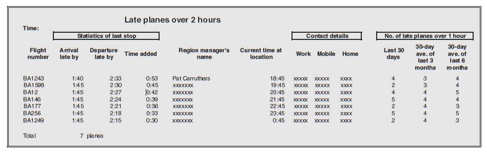
Some KPIs only need to be reported weekly. Exhibit 5.5 is an example of how the KPIs could be presented. Note that while all the KPIs will be graphed over time—at least 15 months—only the three KPIs showing a decline in performance would be graphed. The other two KPI graphs would be maintained and used when necessary.
EXHIBIT 5.5 Top five KPIs Weekly report xx xxxx 20xx
Monthly Reporting
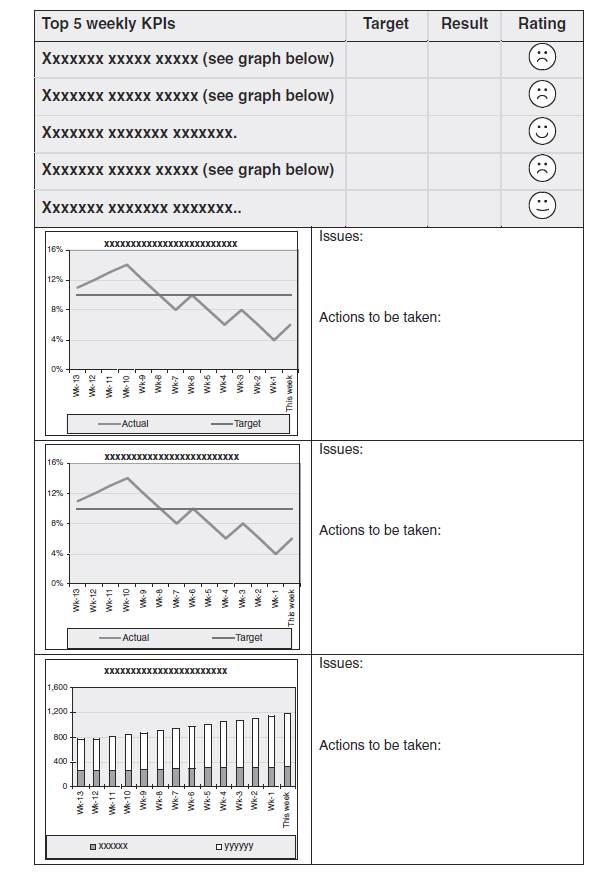
Performance measures can be shown endless ways, whether in a balanced scorecard or not. Performance measures can be shown through icons, gauges, traffic lights, and so on. Exhibit 5.6 is an example of a Stephen Few dashboard.
Too often too little thought goes into the design of these management reports. A must visit for all report designers is Stephen Few’s Web site www.perceptualedge.com), where you can access, free of charge, many high-quality white papers on graphical displays.
His book on dashboard design is also highly rated.
EXHIBIT 5.6 Sales Dashboard
Stephen Few’s contribution to report design is immense. His workshops, books, white papers and articles are a must attend/read for all those involved in reporting performance to the Board, senior management, staff and the general public. All reporting of winning KPIs and other performance measures is vastly improved if one adopts his design techniques in all forms of balanced scorecard reporting.
Few has come up with a very useful list of 11 common pitfalls in dashboard design:
- Exceeding the boundaries of a single screen (where managers have a multiple choice as to what they can see—in other words the designer has not determined what is important).
- Supplying inadequate context for the data (graphs which do not clearly show what is good or bad performance).
- Displaying excessive detail or precision (not rounding enough).
- Expressing measures indirectly. (Few prefers, on occasion, to hold one data series as a constant and express the other as a percentage deviation.)
- Choosing inappropriate media of display (choosing the wrong graph, especially a pie chart; using a graph when a table would be better; etc.).
- Introducing meaningless variety (using a myriad of different graphs on one page, just because we can do them).
- Using poorly designed display media (lack of thought regarding the real issues).
- Encoding quantitative data inaccurately (by setting the starting scale away from zero).
- Arranging the data poorly (by not linking issues together and not positioning graphs on the same point together).
- Not highlighting what is important (all data competing for attention).
- Cluttering the screen with useless decoration (too many rocket scientist’s toys).
Each one of these pitfalls is explained in detail in his white paper on the topic.
Reporting Performance Measures to Staff
Team Balance Scorecards
Exhibit 5.7 is an example of a team scorecard using Excel. Excel is a useful tool to design and test a template before a more robust and integrated solution is sourced.
Some providers supply graphs, help you develop them, and then charge by usage. One such provider is Ergometrics
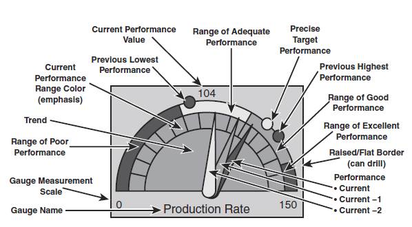
Exhibit 5.8 presents another speedometer report. Exhibit 5.9 explains how the graphs in Exhibit 5.8 are interpreted.
EXHIBIT 5.7 Team Scorecard Designed in Excel Example
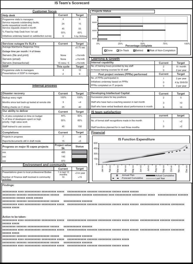
EXHIBIT 5.8 Team Speedometer Report
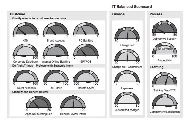
EXHIBIT 5.9 How One Company Has Made the Speedometer Give More Information
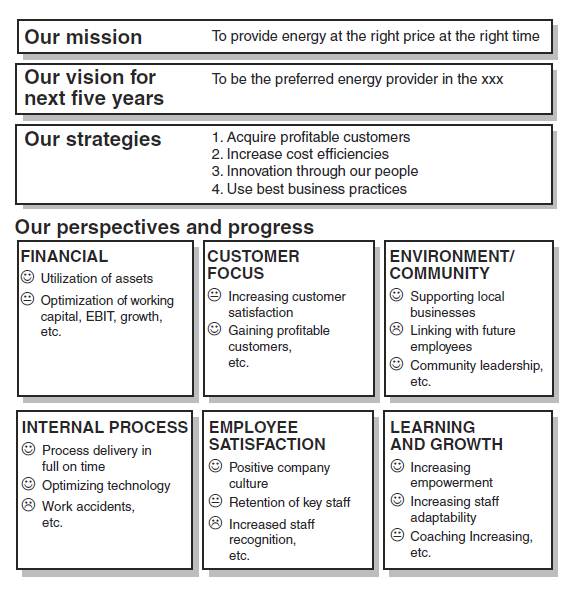
Reporting Organizational Progress to Staff
It is a good idea to have some form of monthly icon report for staff, a report that would not be damaging to the organization if it found its way to a competitor. Icon reports are ideal, as they tell you what is good, what is adequate, and what needs to be improved without giving away core data. Exhibit 5.10 is an example of an icon staff report that covers the CSFs and reminds staff about the strategies.
EXHIBIT 5.10 Icon Report for Staff Example
Copyright Info
Key Performance Indicators (KPI): Developing, Implementing, and Using Winning KPIs, 2nd Edition, 2010.
Reprinted with permission of John Wiley & Sons, Inc.
By David Parmenter
TABLE OF CONTENTS
- Ten key performance indicator (KPI) templates for your dashboards
- Creating key performance indicator (KPI) reports and dashboard design
- Twelve KPI dashboard examples & KPI scorecard examples to get started
More on transaction management and operations:
- Continue to the next section: Twelve KPI dashboard examples & KPI scorecard examples to get started
- Download a free PDF of this chapter: Key Performance Indicators: Developing, Implementing and Using Winning KPIs
- To purchase the book or similar titles, visit Amazon.com
- Read other excerpts from data management books in our Chapter Download Library