
Sergej Khackimullin - Fotolia
Build a Graphite dashboard for data analysis, visualization
Data visualization is a powerful capability for IT admins and business managers alike. In this tutorial, learn how to create charts and dashboards in Graphite, an open source monitoring tool.

Compared to textual information, visual reports make it easier to understand and analyze data. And because Graphite, an open source monitoring tool, displays metrics from both the present and recent past, IT teams can discern important trends in their data, and identify unique events that require immediate attention.
Graphite is designed to plot time-series data onto graphs and update those graphs in real time. This makes the tool ideal for monitoring not only IT systems, but industrial machinery, as well as retail and other business applications. In Graphite, the dashboard screen can contain multiple graphs.
When IT admins use a Graphite dashboard, they can view raw metrics, including:
- end-to-end application latency
- disk use
- memory use
- CPU use
- machine learning pipelines
- cluster health
- network traffic
- intrusion detection risks
Graphite, however, would not be too useful if it only drew and displayed raw data. Instead, the tool comes with a slew of functions that admins can nest to create elaborate algorithms and filters. They can also use a machine learning framework, such as Apache Spark, alongside Graphite to take the guesswork out of anomaly detection. An IT admin can filter out outliers, and track information such as averages, percentiles and standard deviations.
Ceres and Whisper Database
Graphite currently has two databases: Whisper and Ceres. According to Graphite documentation, Ceres will eventually replace Whisper, but it's not yet being "actively developed."
Each metric in Whisper is stored in its own tiny file, which contains only counts and times. Metrics are stored as they arrive, usually in one-minute buckets. When those metrics reach their configurable retention time, they are collapsed into a single bucket. For example, after one hour, metrics can be collapsed into individual, one-hour buckets.
Here's a look at how to get started with Graphite dashboards and graphs.
Visualize time-series data
As mentioned, Graphite can track a number of metrics related to application and IT system performance. But for the sake of a simple example that illustrates the tool's graphical capabilities, this Graphite dashboard tutorial walks through a use case based on an application for a retail store. We'll use a small Python program to generate sample data.
Let's say a motion detector counts people as they enter and exit a store, and uploads that count to Graphite once per minute. Another detector keeps track of how many people are waiting in a cashier line.
Because the retailer knows how many people enter the store, leave the store and are queued up at the cash register, it can potentially extrapolate how many people walk out of the store because the line at the cash register is too long. This data would enable a store manager to know when to open an additional cashier lane to prevent customers from leaving.
To get started, install Graphite and add the Python stats package:
pip install statsd
In our example, we are going to use three stats functions:
Time -- represents the duration of an event. We will use this function to store how many people are waiting in a cashier line. In this example, we'll draw random values from the Poisson statistical distribution, a skewed distribution commonly used for this type of analysis.
Gauge -- a metric that keeps a constant value until changed. This metric is perfect to keep track of how many people are in the store at the present time. We'll draw values from the sine function in geometry, as that curve mimics the ebb and flow of customers in a retail store throughout the day.
Increment -- a counter that keeps track of how many people have left the store. When the number is negative, that represents the number of customers who have entered the store.
Assign each metric to a type -- timer, gauge or incrementer -- using Python, as shown below. The name is in bold, and the type is in blue:
c.timing("cashier.line",cashierLine)
c.gauge("inStore", inStore)
c.incr("leftStore", leftStore)
To push this information to Graphite Web, run the Python code below:
from statsd import StatsClient
import time
import math
import numpy as np

c = StatsClient(prefix='stores')


i = 0
wasInStore=0
inStore = 0

while (1==1):
    i = i + 1
    cashierLine = np.random.poisson(lam=(0,6),size=(1,2))[0,1]
    t = np.arange(0, 10, 0.1);
    amplitude   = np.sin(t)
    wasInStore = inStore
    inStore = int(amplitude[i] * 100 ) + 100
    leftStore = int(wasInStore - inStore)
    print("people in line=", cashierLine, " people in store=", inStore, " left store=",leftStore)
    c.timing("cashier.line",cashierLine)
    c.gauge("inStore", inStore)
    c.incr("leftStore", leftStore)
    if i == 99:
        i=0
    time.sleep(1)
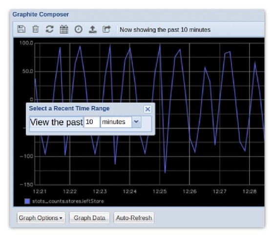
Graphs update in real time by default. Change the window of time to only a few minutes when you run the code above, as it sends a metric every second. Otherwise, the graph will be too crowded if the time mark, or the scale, is set to hourly, for example.
Navigate the metrics tree
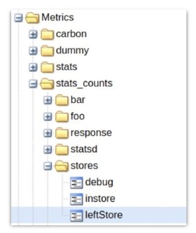
There are two folders that contain metrics: stats and stats_count. Timers, gauges and incrementers are each stored in different sub-folders, as we explain further below.
Since, in the code above, we set the top-level metric to be StatsClient(prefix='stores'), everything else is listed below that.
Find leftStore under stats_counts, going down the tree one level for each dot in the metric, as in stats_counts(dot)stores(dot)leftStore.
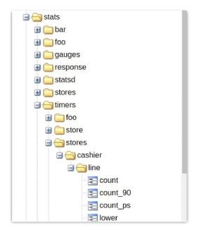
Gauges and timers are in subfolders under stats. To plot the number of people in line, navigate through stats->timers->stores->cashier->line->count, as shown in the tree below. We also see the option to plot the 90th percentile, mean and standard deviation.
Create graphs for a Graphite dashboard
A graph contains the time metric along the horizontal -- or X -- axis, while the metric is along the vertical -- or Y -- axis.
From the first screen in Graphite, click the word "Dashboard" to access the dashboard screen. To add metrics to the dashboard screen, click them in the metric tree displayed on the left. Alternatively, type the first few letters of the metric you wish to add into the dashboard screen to find and select the metric.
When you select a metric, Graphite adds it to the graph and to the legend at the bottom.
In our example below, you can see the number of people entering and leaving the store goes up and down in a cyclical fashion, which creates a sine curve graph. To change the time window, click on the clock in the tool bar:
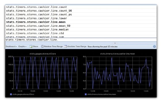
The Graphite dashboard below has two side-by-side charts that show the number of people in line count and the average number of people in line, using stats.gauges.store.inStore and stats.times.stores.cashier.line.mean.
Functions and filters
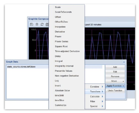
Functions and filters can further transform time-series data. To apply functions and filters to a graph, click the Graph Data button on the first screen, highlight a metric, then click Apply function. Click again to make nested functions, which help build complex algorithms.
For example, since a negative number of people leaving the store indicates that people are actually entering the store, we could apply a filter to select metrics below zero, and then use the absolute value function to show the number of people coming into the store.
So, in the end, how many people have walked out of the store because the cashier lines were too long? It's not easy to tell, exactly. We don't know how long people have stayed in the store since we don't know the exact identity of those who come in. But there's obviously a relationship between the length of the cashier lines and the increase in the number of people exiting the store, when the number of people entering increases as well. You could plug this data into a regression model and find out whether the correlation is strong enough to make reliable predictions.