Observability maturity favors data clarity over quantity
Experienced SREs share lessons learned about making effective use of copious amounts of observability data, from pre-collection priorities to data visualization.
Site reliability engineers are tasked with maintaining the observability of systems, and while detailed data-gathering tools can help, they can also hinder visibility if not used correctly.
That was a major theme among presentations from expert site reliability engineers at this month's SRECon. To wit, it's not about how much data is gathered; it's about how well it's used to serve the business, keep systems running smoothly and keep team members informed. Observability, a term that has supplanted IT monitoring in cloud-native environments, refers to a practice in which systems can be queried effectively to troubleshoot or prevent problems in real time, with an emphasis on overall user experience rather than on the performance of individual system components.
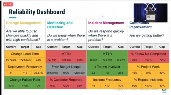
Making good use of observability data starts with asking the right questions, aligned with the needs of the organization, according to presenters from SRE software vendor Blameless, who showed examples of their internal dashboards that track service reliability according to business priorities.
"As leaders in SRE, you can often be perceived as the bearer of bad news, especially to management," said Christina Tan, a member of the Blameless strategy team. "Understanding business needs [means] that instead of being seen as a cost center, for SRE teams, you can show how you contribute to business goals and business growth."
Places within each enterprise where system reliability needs improvement can seem endless, but SREs must prioritize what goals are most important. Aligning observability data gathering to specific goals will also help SREs present a more useful set of metrics to developers and business leaders.
"When companies invest in incident resolution, they may still have the same number of incidents, but the severity of customer impact will significantly decrease," said Mindy Stevenson, director of engineering at Blameless, in the SRECon presentation. "And so perhaps instead of the number of incidents, incident severity is a better measure."
Blameless engineers presented at SRECon about prioritizing observability questions to align with business goals.
Observability starts with strong queries
Blameless presenters broke prioritization questions down into four categories: change management, monitoring and detection, incident management and continuous improvement. The size and maturity of the organization will dictate which questions SREs should ask when gathering data. For example, a mature enterprise SaaS company may emphasize satisfying an existing customer base and minimizing risk, while a smaller startup in the growth phase might favor making changes quickly and responding to problems as they arise.
Prioritization can help, but SREs must also be aware that the metrics they choose to focus on may have unintended consequences, Stevenson said.
For example, setting a lower target for cycle time in software delivery -- the amount of time it takes for a team to complete a task or project -- might mean a team feels pressure to move faster and be less careful and diligent in code reviews.
"The potential for negative consequences or outcomes shouldn't keep us from creating metrics," Stevenson said. "[But] it's worth taking the time to think through each of these metrics in detail, because there can be impacts to them."
Once SREs set metrics and gather data, they can perform gap analysis to determine what areas are most in need of improvement, and demonstrate that to the business. While they should be able to show improvements and successes, marshaling data can help SREs bring up the need for improvement without necessarily sugarcoating it, either, according to Stevenson.
"It creates transparency and a willingness to admit when things are not perfect," she said. "When you have everyone across the organization -- from engineering teams to the VP of sales -- with access and visibility into the same dashboard, [it] creates a common understanding and ability to have a conversation, with the supporting data, of why we would focus on one area or another."
Campspot narrows aperture on observability spotlight
Another SRECon presenter compared observability tool sprawl to light pollution in the night sky -- there can be too much light shining on problems from too many directions. For Campspot, a company based in Grand Rapids, Mich., that provides online booking services for campsites and RV parks, standardizing on one distributed tracing tool from Honeycomb.io that everyone in the engineering organization could use provided a much-needed focus.
"We were attempting to shovel all of our Java application metrics into Prometheus, and it just wasn't getting the job done for us," said Kristin Smith, DevOps services team lead at Campspot. "It was difficult to see how our growing ecosystem of applications spoke to each other, and we ran into issues with a lot of new [college graduates] and bootcamp graduates who'd never looked at app metrics before, and suddenly, they had to learn PromQL on top of everything else."
Honeycomb's distributed tracing tool provided data about the relationships between applications, and the ability to track customers as they moved through the online booking system. In addition, the company began to send all alerts about IT performance issues through PagerDuty.
"No more secret alerts in emails to developers because they didn't want to scare anybody," Smith said. "No -- we need to know what's happening."
Campspot SREs also decided to set "good enough" service-level objectives (SLOs) as it revamped its observability instrumentation, although Smith said if she had it to do over again, she would have involved business leaders, especially sales managers, earlier in this process.
"I set up the second week of this Honeycomb implementation, which was supposed to be our SLO workshop, and I was so excited," she said. "All the salespeople got in the room and said, 'What do you mean we're not talking about uptime!?'"
Smith's intentions to prioritize metrics other than uptime -- including performance, customer experience and acceptable levels of failure within the company's systems -- were good, she said, but could have been better explained to salespeople.
"Had I started with our sales team and said, 'Hey, I know you don't necessarily care about how all of the sausage is made, but we are thinking about moving toward a system where we make agreements with our customers that tells them exactly what we want to offer them for each of these workflows instead of just uptime,' that team would have taken it and sold it to every single customer before we even signed a deal with Honeycomb," Smith said.
We need to be careful when we talk about turning down alerting that we are very, very, very clear that we are not trying to go back to cloudiness.
Kristin SmithDevOps services team lead, Campspot
Instead, Smith encountered a kind of organizational technical debt because of the ways monitoring and alerting have been implicitly tied to safety, prosperity and job security in many companies.
"We need to be careful when we talk about turning down alerting that we are very, very, very clear that we are not trying to go back to cloudiness," she said. "We are just trying to turn it down enough to focus what we're illuminating on [that which] is most important and not just on things that are symptoms."
A data visualization call to action for SREs
Enterprise engineers -- and the vendors that sell them observability products -- must improve data visualization, said Dan Shoop, a senior SRE at location-based advertising company GroundTruth in New York.
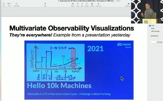
"It's very popular for observability platform vendors to produce lots of charts, but we need ... multivariate observability visualizations," Shoop said in an SRECon presentation. "In other words, including multiple different types of [high] cardinality data in a particular graph rather than having them all in separate cells."
SRECon presenter Dan Shoop showed a slide from another presenter's talk as a demonstration of good data visualization.
Other common pitfalls in data visualization design include lack of common scales for multivariable data represented within the same graphs, which can create misleading assumptions; imprecise use of data such as percentages and averages; "chartjunk," such as color shading that obscures what a graph is meant to represent; truncated or torn graphs; and missing scales, keys, attribution and other critical explanations. Accompanying words can be just as important as pictures in effective data visualization, according to Shoop.
"Engineering and science are about repeatability," Shoop said. "[Linking directly to an original chart for attribution] would allow other engineers to double-check our work but also maybe steal a good pattern for reuse."
To demonstrate this point, Shoop showed a graph that another SRECon presenter had used in an earlier presentation. The style of the graph was a crayon drawing, but it layered multiple data points over one another to create a more meaningful whole and included simple verbal descriptions, Shoop said.
"Sometimes, really, all you need is just to be able to express [things] however you can," he said. "You don't really need much in tooling sometimes, other than, like, a crayon."
Beth Pariseau, senior news writer at TechTarget, is an award-winning veteran of IT journalism. She can be reached at [email protected] or on Twitter @PariseauTT.