10 dashboard design principles and best practices
Dashboards are a key tool for delivering analytics data to business users. Here's how BI teams can design effective dashboards to help drive informed decision-making.

BI dashboards display KPIs and other important data for business executives, managers and workers in a visual interface. Good dashboard design considers both the data needs of users and UX, as well as overall business goals. It's not just about presenting numbers but also figuring out what to draw attention to and how to do so effectively.
"Dashboards should do more than display data -- they should play a critical part in driving action across the business," said Paul Rakotoarisoa, principal consultant for strategy and decision intelligence at Mazava Consulting.
At a high level, he added, this needs to be underpinned by a framework that defines how the data built into a business intelligence dashboard supports the objectives of BI applications. Other upfront considerations include what data to display and how granular it should be. Data quality and transparency are also crucial factors in accurately sharing information and relevant context to help guide business decision-making.
Why is good dashboard design important?
Well-designed dashboards that are visually appealing and deliver useful information enable companies to get more business value from their data assets. Dashboards provide views of revenue, product sales, orders, profits and other business metrics, using both historical and real-time data. Engaging layouts and illuminating data visualizations ensure that business decisions are based on the presented data, making them more informed.
BI practitioners said successful dashboards can also increase data literacy in organizations and spark more curiosity about data among business users, prompting them to dig deeper into it in search of valuable insights.
Dashboard design best practices and principles to adopt
This makes it imperative that BI managers and their teams adopt a solid, carefully considered dashboard design process. To that end, here are 10 principles, best practices and design tips for building effective dashboards to support different BI applications.
1. Prioritize simplicity and consistency in dashboards
"Dashboards should prioritize simplicity," Rakotoarisoa said, cautioning that too much information creates clutter and can overwhelm users. He finds that the most effective dashboards focus on key metrics and feature a clean, hierarchical design that guides users through the data and ensures that the most critical data points and insights stand out.
Visual consistency should also be maintained when choosing fonts, colors and layouts, Rakotoarisoa said. Overall, BI teams should strive to minimize the cognitive load on users so they don't have to think too hard about navigating a dashboard. Making it easy to interact with dashboards enhances their usability -- and, ultimately, how well users understand the data they contain.
2. Provide data context and usage guidance to dashboard users
Failing to include business context about the data in a dashboard or guidance on its potential uses is a common design error. When that happens, it's unclear to users whether the information being presented is relevant to their jobs, and they might view a dashboard as a source of noise rather than a useful tool.
To avoid such situations, BI teams need to craft dashboards for specific types of users and make sure their intended use is clear, said Travis Rehl, CTO and head of product at cloud services provider Innovative Solutions. Doing so "greatly increases the usefulness of the dashboard and makes it the landing page of choice for individuals," he noted.
Dashboard designers should also think about how to help users find desired information on specific business issues, rather than trying to make a dashboard the be-all and end-all of data analysis capabilities, according to Rehl.
For example, good dashboard design considers what users will want to look into at the start of the workday, he said. The first questions people have can be as simple as how the business is doing at the moment or whether anything important happened the day before. A well-designed dashboard makes it easy to get such information. "Regardless of the data you're trying to convey, you need to have [entry points] that invite the user to explore your data and find their answers," Rehl said.
3. Keep data cruft out of dashboards
Including too many KPIs and other business metrics in a dashboard complicates the data analysis process and often leads to "dashboard fatigue" for users, Rehl warned. "If your target audience is an executive who cares about a particular KPI, only show the relevant data specific to that KPI."
Soumya Bijjal, senior vice president of product at open source data infrastructure platform provider Aiven, made a similar point about avoiding cruft -- unneeded data and visualizations that get in the way of users. "By designing dashboards to understand each user and present only the necessary information, companies will get a lot more out of their data," she said.
4. Think through the user experience
BI dashboard designers sometimes treat all data as equal, Bijjal said. But more thoughtful choices on data presentation and built-in analytics capabilities can have a significant impact on a dashboard's UX, she added. That, in turn, will influence how effectively the data in the dashboard is manipulated and used.
For example, a user often begins by searching for an answer to a specific question. A valuable dashboard delivers the answer but also offers views of larger trends and provides drill-down data analysis features, Bijjal said.
"Great dashboards are also individualized and customizable, allowing different teams to craft different [versions] for their own purposes," she said. This helps address a common challenge: Dashboards often have multiple audiences. It's difficult to create a positive UX for each of them in a one-size-fits-all design.
5. Choose the right data visualization types
Dashboard designers can choose from a plethora of data visualization options, from conventional line charts, bar charts and pie charts to more complex graphs and visuals. But they need to consider how different charts and other visualization techniques will affect the experiences of dashboard users.
"It's important to understand what type of information you want to convey and choose a data visualization that is suited to the task," said Manjulla Mahajan, vice president of enterprise technology, data and AI at Roller, a vendor of cloud-based software for museums, zoos and other leisure and entertainment venues. She recommended that designers ask the following questions to help narrow down the right chart type or other visualization for a data set:
- How well does the visualization relay the intended information?
- Does it contain extraneous data or other distractions that might confuse users?
- Does it appeal to people's visual perception for making sense of information?
Often, though, the most effective approach is to use multiple visualizations. "There's a time and a place for most visualization techniques, and the best way to address a given use case is usually a variety of different visualization techniques in one view," said Joshua Moore, principal technologist for global cloud analytics at data storage and services vendor NetApp.
6. Focus on layout, colors, labels and other design elements
Basic design elements have an outsized impact on how users view dashboards and interpret the data they contain. For example, the use of colors sometimes makes the difference between good and bad dashboard design. "Wrong color use can really break a visualization, and it's probably the first thing people notice," said Patrik Lundblad, a visualization advocate and lead product designer at data management and BI software vendor Qlik.
Keeping data visualizations and dashboards color-neutral is often considered boring by users. But adding too much color in the wrong way can confuse people and lead them to reach incorrect conclusions about data -- especially in cases where poor color choices are combined with other bad design practices, such as an inverted Y-axis in a chart.
Other items that can affect the success of dashboard designs include titles, labels and explanatory text, as well as the use of white space and the overall layout of a dashboard's components.
7. Tie BI dashboards into business processes
Dashboards are generally considered to be informational in nature. Increasingly, though, enterprises are also using them as an analytics interface in operational systems and processes. Doing so closes the gap "between discovering insights and taking action," said Pedro Arellano, co-founder and CEO of Wallabi, an AI-based analytics strategy and development services provider.
For example, marketing departments use curated data sets and dashboards to automatically adjust their bids on online ad placements based on how the ads are performing, Arellano said. Designing dashboards for such uses requires BI teams to simplify the way data is organized and presented to different users involved in the supported business process, he advised.
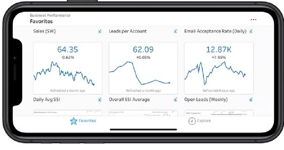
_mobile.png)
8. Design dashboards for the workflows they support
In a similar vein, Bharath Thota, a partner in the analytics practice at management consulting firm Kearney, said dashboards should be designed to surface important data insights within the regular workflows of the intended users.
For example, interactive elements such as filters, drill-down capabilities and user input fields can be included in a dashboard to enable dynamic scenario analysis. Dashboards might also incorporate live data feeds that provide up-to-the-minute insights, keeping users informed about business situations and developments so they can act quickly when needed. Conversational AI tools built into dashboards help users interact with data more efficiently while handling their usual tasks.
9. Formalize the dashboard design process
Thota recommended that BI teams do the following to structure and guide the dashboard design process:
- Document the strategic goals and objectives that dashboards must support to move the company toward its business vision.
- Ensure that the design plans also incorporate a comprehensive view of data related to functional goals -- for example, enterprise ones filtered through a value-chain lens.
- Identify both internal and external triggers that affect business performance and need to be reflected in dashboards.
- Clearly describe actions that can drive performance improvements based on the data presented in dashboards.
- Track concrete metrics from key data sources to ensure that goals are being achieved and pinpoint business issues.
- Use periodic scorecards and aggregated performance views to provide strategic guidance to dashboard users.
10. Make dashboards action-oriented and user-centric
Karel Callens, CEO and founder of embedded analytics software vendor Luzmo, suggested that in addition to being simple to navigate and read, dashboards need to be action-oriented and user-centric. "A good dashboard should inspire action," he said. This helps deliver on the goal of making users more data-driven.
Callens said user-centricity is the hardest part to get right because there are so many contexts within a business that can affect the best way to highlight data in a dashboard, depending on the target audience. For example, the CEO requires different information than a sales manager does. Meeting the data needs of everyone who can benefit from using a dashboard multiplies the design complexity.
Dashboard layout is also a complicating factor. For example, Callens said that in Western countries, the most important information is typically positioned at the top left of the screen, while it should be at the top right in Eastern countries. Such modifications "are small changes that have a significant impact" in personalizing dashboards for users, he noted.
Editor's note: This article was updated in November 2025 for timeliness and to add new information.
George Lawton is a journalist based in London. Over the last 30 years, he has written more than 3,000 stories about computers, communications, knowledge management, business, health and other areas that interest him.