
Fotolia
How does time-series analysis work in IT environments?
IT monitoring metrics are crucial for enterprises to gauge performance and plan for future events. But admins should understand the tradeoffs between a time-series and point-in-time analysis.

IT operations teams rely on monitoring tools and processes to gain critical insight into system health. But it's not enough to set IT monitoring thresholds based on conventional wisdom alone.
To reduce false alerts and detect anomalies related to IT security, application response time and more, consider the use of time-series analysis -- but be prepared to first understand how this form of monitoring works, and how it differs from a point-in-time monitoring approach.
Point-in-time vs. time-series monitoring
Time-series analysis and point-in-time analysis are closely related, but feature some important differences: Time-series analysis plots metrics over time, while point-in-time analysis examines one specific event at a particular instant.
The former enables an analyst to drive seasonality -- the normal rise and fall of events due to the time of day, month or year, and other predictable variations -- out of the model. This enables the analyst to account for the cyclical nature of business and not waste time on outliers that are statistically insignificant.
Some IT monitoring metrics lend themselves to a fixed point-in-time metric and threshold. For example, a disk drive that is 100% full is a point-in-time metric, and a threshold, that an IT admin must address immediately.
Other metrics rise and fall in a predictable manner, so it's best to examine these over a span of time. For example, Java Virtual Machine (JVM) garbage collection represents a cyclical process, so it's a metric that an admin can trace in a time-series display.
As a Java application runs, it creates objects in memory storage. When the memory allocated to the JVM is full, the JVM performs a garbage collection, which destroys objects that have gone out of scope. The application freezes at that point, so it's important to configure the JVM to both be the right size and perform garbage collections regularly.
Limitations of fixed thresholds
Both point-in-time and time-series monitoring processes use thresholds, but do so differently. A time-series monitoring has variable thresholds because analysis must account for the cyclical nature of certain IT and business events. A point-in-time monitoring system uses fixed thresholds.
This approach to performance monitoring is sometimes no better than a simple guess. With this approach, thresholds are set via:
- Empirical observation
- Conventional wisdom
Conversely, a more effective approach -- including for those who use time-series monitoring and analysis -- involves the following:
- Classification analysis
- Regression analysis
- A moving normal distribution
Classification analysis vs. regression analysis
Regression and classification analysis are associated with machine learning.
Classification analysis groups items into clusters. It picks some random value and evaluates data points to calculate the distance to other data points from that specified point. It repeats this process until it finds the shortest distance of each point around some cluster. These clusters are often graphed using distinct colors to make the groupings easier to see.
This process is typically used in cybersecurity to investigate events. For example, users are classified as normal users or power users; a surge in activity, such as a normal user sending an abnormal amount of data outside the network, is flagged as an event that IT admins should investigate.
This approach also applies to many IT monitoring tasks and a wide range of data sets. For example, an admin could plot database searches by connected clients to flag potential database performance issues. Long searches could indicate a missing or corrupt index.
Regression analysis finds correlations between variables in processing time-series data, to predict future events based on what has already happened. This approach creates a predictive model that IT admins can use to, for example, predict the load on an e-commerce application given upcoming external factors, such as the launch of a new product or a discount offer. The IT organization can then spin up additional resources to handle the predicted surge in volume.
A moving normal distribution
An admin gathers the normal distribution from historical events taken over some period of time. The moving normal distribution uses smaller slices of time-series data to track the curves -- meaning trends and predictable variations.
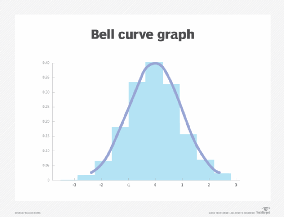
Most people have heard of the bell curve. This is a plot of the probability of all possible events, where the highest point of the curve represents the mean, or the average value across the data set. The variation in events, measured in distance from the mean, is called standard deviation.
Organizations that set IT monitoring thresholds based on conventional wisdom already follow this model -- even if they aren't aware of it. Statistics and guessing are both based on the assumption that, most of the time, a system operates at a normal level of behavior. Wide variations from that behavior indicate a problem.
But a statistically derived bell curve is grounded in logic, which makes it inherently better than guessing for setting thresholds.
For instance, an admin can set a threshold based upon events that are at three standard deviations. This could be useful to set a threshold for webpage response time where the average response time is 100 ms. The admin gathers response data over time and records it -- a simple spreadsheet is sufficient -- and then uses the standard deviation function to process the data entries and determine the within-normal range of response times.
Based on this information, the IT admin can set a monitoring alert threshold, possibly related to a service-level agreement or business goal.
The problem with a single point in time
The problem with this approach, however, is that it looks at events over a random period of time, which doesn't account for the aforementioned cyclical nature of events.
The sine function plot below illustrates this cycle. For example, the number of users on a bank's webpage rises and falls during the business day, and this pattern repeats every day. Similarly, the number of transactions on a shopping website trends up during the holidays and falls after them. Within this curve there is another curve, which requires a more complex chart than a simple sine function.

The best solution is to combine the sine wave with a series of bell curves that account for the business case, with time slices at the high and low points of system load, which ultimately should look something like the chart below.

But that conglomeration only handles seasonality, not trends. Trends are the long-range curves that carry the shorter-range cycles. For example, over time, these curves climb further upward as the business grows. The model that flags outlier events can be adjusted for this as well, and the forecast can be changed accordingly.
Elasticsearch anomaly detection
IT organizations can use tools such as ElasticSearch to draw time-series monitoring charts of performance data. Normally, the IT organization's admins create time-series charts from their monitoring data and hire analysts for guidance.
But those charts in isolation still do not provide the whole picture. Machine learning can do a backward-looking, trend-aware, moving probability distribution. In graphic terms, machine learning shifts the bell curve up and down the timeline to follow the cyclical nature of events. This dynamic threshold monitoring takes normal fluctuation into account, and thereby only detects true anomalies.
Anomaly detection is the probability of an occurrence given all previous behavior. Events are flagged as anomalies when they fall outside expected behavior by some designated number of standard deviations. For example, the Elasticsearch machine learning feature turns that measurement into a number that ranges from 0 to 1, where a 1 is considered an anomaly.
This process enables the system administrators, developers and managers to consider current stats in light of what is expected to be normal during this time of day and this time of the year.