
Sergey Nivens - Fotolia
Improve data visualizations, become a better storyteller
Visualizations that make sense and are important to your audience's goals help you tell better stories with data. Color, layout and the type of data you display play a role.

Mastering storytelling through data visualization enables you to turn data into a message your audience can understand and use to achieve business objectives.
Data analysis is essential to the modern business. Sales figures, financial reports, marketing results and competitive trends offer potential for insightful, informed decisions. But the data is often presented badly. It might be unclear or difficult to make sense of, or it might be presented as just numbers and facts, with no argument or guidance about how to use it.
Data visualizations can solve the problem by clearly communicating important data insights to people of all technical skill levels. BI tools include wizards or guides that help you build effective, if basic, data visualizations. Creating effective data visualizations requires that you understand how to tell your story to your specific audience.
How to tell your data story
A data visualization is more than just an image of data points and analysis results. The selected data, visualization type and structure of the message all require careful curation for the intended audience.
Know your audience
If you have ever read a story to a child or grandchild, you must sometimes change the words, insert an explanation or repeat yourself to match the story to your little one's understanding.
Without being patronizing, you must apply the same art of storytelling for any audience, including business decision-makers. You need to understand their knowledge level, interests and goals. Effective storytellers adapt their language and the complexity of their message to match the audience's expertise and familiarity with the data.
The most effective technique for finding the right level is to anticipate the questions your audience might ask and ensure that the story, its context and detail provide the right answers. If the context or the explanation detracts from the flow of the story, you are pitching at the wrong level.
I once presented an analysis of customer demographics and said that the low standard deviation (SD) was an important point to note. Then, the question came up that I hadn't anticipated: "What's a standard deviation?" The conversation detoured into a brief lesson in statistics. If I had anticipated that question (I should have), then I could have explained the significance of the SD briefly in the flow of my presentation or made the point differently. As it happened, my presentation lost momentum because I misread my audience.
Data analysis for insightful storytelling
The most important stories are the ones that matter to your audience -- they need to care about the message, the outcome and the next steps. Successful data stories must begin with carefully selected data that aligns closely with your message for the audience.
During data analysis, look for key insights. Three particular types can capture your audience's interest in the data story:
- Outliers and anomalies. Outliers or unusual data points might surprise your audience and help capture their interest. This encourages them to go along with your exploration of the underlying reasons or patterns behind the data. Even an insignificant outlier shows your thoroughness and builds confidence in your analysis.
- Contrasts and comparisons. Most types of data analysis are a comparison between different groups, periods or categories, revealing trends or highlighting differences. Presenting side-by-side comparisons can clarify a story and help audiences understand the context and significance. For example, it might be difficult to say a quarter's margin was good or bad until you compare it to the last quarter, last year or your strategic plan.
- Projections and forecasts. Everyone in business wants to know the future. Forecasts provide audiences with a glimpse of possibilities based on current trends, making the data story forward-looking. You can use predictive analytics for forecasting, but it's not required. If your audience isn't data-savvy, simple analyses -- such as trendlines or moving averages -- can be compelling.
Arrange any insights you discover logically along your story timeline. No set pattern is best, but you might want to cover outliers and anomalies first to show you considered data quality and reliability, building confidence in the data and your work. You might want to leave projections and forecasts to the end of a presentation or story to set the scene for the following conversation.
Don't start with the problem
It's tempting when telling a data story to get to the point straight away, especially when you are addressing a business problem. However, stating the problem first can cause your audience to make assumptions that aren't proven or disproven until much later, perhaps at the decision-making point.
Before diving into the problem, consider several questions about your audience:
- Do they share a clear understanding of the current circumstances?
- Do they understand the context of your data story? Do they understand the context of your data story? Why are you presenting it, and what should the outcomes be?
- Do you understand your audience's long-term goals and ambitions?
After you answer the questions, you can address the problem as a barrier to long-term goals. Show how the data connects to real-world scenarios and decisions. Explain what it signifies to provide depth to engage the audience.
If you dive into the problem first, you might find later that people disagree about how to solve it because they disagree about the goals, the context or the current conditions.
Creating meaningful visuals
The most effective visualization of data is one that uses a format most suited to the information you want to convey.

For example, Figure 1 shows a performance score and a satisfaction rating for call center operators. It shows outliers in red. Someone has a high performance score, but a low satisfaction rating, and some are the other way around.

Now, let's look at the same analysis shown as a bar chart. Although the data is the same, it is difficult to make sense of it. The scatter plot in Figure 1 is intelligible even to a nonspecialist.
This is the power of choosing the right visual. Although the bar chart is not good for showing clusters and outliers, it is excellent for showing comparisons, as shown in Figure 3.
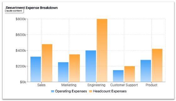
Figure 4 is a line chart, which shows a time series of data, a trend line and a moving average. It enables a sophisticated, but clear interpretation of volatile data.
Although the examples are simple, they show how characteristics are useful, even in more sophisticated visualizations:

- Clear labels help users orient themselves in your visualization to understand what they see.
- The use of color makes features stand out: the clusters, outliers and classifications to compare, and the different timeline analyses. It is easy for a user to glimpse important features.
- They have a little style, but not enough to distract from the analytics. I used subtle shading, which makes the visualization more appealing, engaging and pleasant to work with, but the shading does not distract from the analytics.
- The visualizations are uncluttered. There is no unnecessary detail.
Make sure the story has a point
A good data story enables the audience to make decisions and take actions. If there are decisions your audience should make or actions they should take based on the data being presented, call these out in your conclusion. Wrap up with next steps and actionable suggestions, such as investment decisions or strategic adjustments. In some cases, you might not be the person to propose answers -- perhaps that's for business executives or others to do. But you can raise the right questions, leaving the audience with a sense of direction.
Cultivate advanced data storytelling skills
One of the best ways to improve your storytelling skills is to watch great storytellers and learn from what they do. Examples of effective presentations and data stories are widely accessible online. Steve Jobs was famous for his presentations, of course. But look out also for videos of Garr Reynolds, Guy Kawasaki, Ray Wang and Hans Rosling, and do the following as you watch them:
- Observe how they make their content relatable to their audience.
- Note how they organize the structure and flow of their presentations.
- Notice how carefully they choose their data. It's surprising how little data they use. Great storytellers don't overload their audience: They provide the most telling examples, not every example.
- Evaluate their visuals. Are they clear? Are they distracting?
- Listen carefully to the end of their stories. How do they conclude? What do you feel at the end of the presentation?
Develop an eye for effective visuals
Data visualizations are everywhere. You can find great examples in newspapers, magazines, company whitepapers and reports from consultancies and think tanks. They all include many data visualizations to present their research clearly. Use examples to find what works best for you and copy the best ideas -- that's how all the great artists learned. Take time to practice designing visualizations and ask for feedback from people inside or outside your organization
Cultivate a critical perception of design elements around you, not just in data visualization. Even an art museum often has compelling examples of classical and contemporary design.
Storytellers tell stories
Just as you can learn a great deal about data visualization design from examples you see around you, look for examples of great storytelling. Newspapers, magazines and TV news reports all have good examples. Pay special attention to business news channels because they convey data to investors and business viewers.
Above all, practice your own storytelling. Take time to think about the next email and the next conversation with your team. Can you make it a story? Can you add data visualizations for insight and effect? Yes, you can, and they all offer good opportunities for practice.
Editor's note: To illustrate effective data visualizations without sharing any confidential data, the author used a GenAI tool to create some synthetic data and sample visualizations.
Donald Farmer is a data strategist with 30+ years of experience, including as a product team leader at Microsoft and Qlik. He advises global clients on data, analytics, AI and innovation strategy, with expertise spanning from tech giants to startups. He lives in an experimental woodland home near Seattle.