Fotolia
Top data visualization techniques and how to best use them
BI and analytics teams and self-service BI users can choose from various types of data visualizations. Here are examples of 12, with advice on when to use them.

A wide variety of data visualization techniques can be used to help business users find the meaning in BI and analytics data. Visualization is a core component of the business intelligence process, and many enterprises are seeing an explosion in the need for it, driven by improvements in data infrastructure, wider use of BI tools and a corresponding rise in data literacy.
The core ideas behind data visualization have been around for decades, but visualization options and practices have changed over the years -- and not always for the better. As BI developers and visualization designers got more and more fancy in displaying data, graphics became dense and often inscrutable.
"Finally, we are reaching a place where customer needs drive the design, and clarity is returning," said Gary Davis, senior UX designer at CloudCheckr, a cloud management platform vendor. Ultimately, Davis added, designers are still trying to solve the same problem: finding the best way to communicate data analysis results to answer business questions.
Instead of using standard data visualizations, BI analysts and data scientists increasingly are creating custom ones "that can help tell the story in an intuitive fashion," said Ramesh Hariharan, CTO at consulting firm LatentView Analytics. But they and self-service BI users need to tread carefully in employing the cutting-edge techniques and interactive capabilities built into today's data visualization tools, he cautioned. "The mistakes in visualization far outweigh the mistakes in other aspects of data analysis, both in terms of frequency and impact."
Davis, Hariharan and other BI and analytics practitioners weighed in on some of the best -- and worst -- ways to use common data visualization techniques, from line and bar charts to more elaborate methods of visualizing data. Here are 12 of those techniques, with an example of each.
Line charts
Line charts are familiar to most people, and well-designed ones can be easily analyzed at a glance. "Nothing is better than a good old line plot when monitoring numerical attributes over time," said Paolo Tamagnini, data scientist at open source analytics software vendor Knime AG.
Line charts can show different measures of categorical attributes on separate colored curves so users can quickly compare them. In addition, making a line plot interactive can help users browse through a large number of curves that might be confusing in a static visualization.
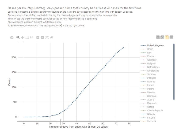
During the COVID-19 pandemic, for example, line charts have been the most used data visualization technique to illustrate the spread of the disease and to compare the effectiveness of containment measures country by country, as in the interactive example provided by Tamagnini that's shown below.
Bar charts
The bar chart is one of the simplest and best known data visualization techniques. "Humans eyes are really good at comparing the length of sorted bars -- not angles, not color gradients, not curved shapes," Tamagnini said. "That's why I still love to use bar charts whenever I can."
Patrick Miller, who leads the data reporting and visualization team at consulting firm West Monroe Partners, said bar charts can be understood by virtually anyone without training or explanation. But watch out for the temptation to make them too busy, he cautioned.
Pie charts
The pie chart is another well-known type of data visualization, in which different percentages of a whole are represented as slices of a pie. They make great eye candy, but visualization experts said they don't convey the differences between data as well as other techniques do. As a result, they can be hard to interpret.
"Pie charts rank low in precision because users find it difficult to accurately compare the sizes of the pie slices, although such charts can be helpful when you're giving a high-level message," said Manjula Mahajan, director of data and analytics at storage vendor NetApp.

Bubble charts
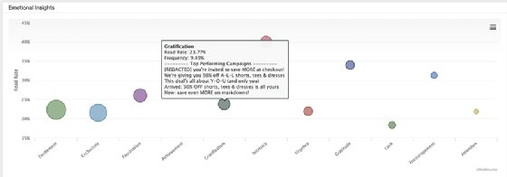
Bubble charts are used to express three dimensions of data based on the x-y location and size of each bubble. With minimal explanation, a bubble chart can provide useful information about relatively complex data sets, said Chris Adams, vice president of product management at SparkPost, maker of a predictive analytics platform for analyzing email outreach efforts.
Adams recommended, though, that the labels for the various bubbles be clearly visible. Also, he said the bubbles should be sized so they don't bump into each other and are different enough to quickly convey insights about the data they represent. For example, in the SparkPost visualization shown below, the bubble sizes indicate the relative frequency in which different sentiments were used in the subject lines of an organization's email campaigns.
But not everyone is a fan of bubble charts. Mahajan said they aren't always a good fit for BI dashboards and can require too much mental effort to understand "due to their lack of precision and clarity."
Histograms
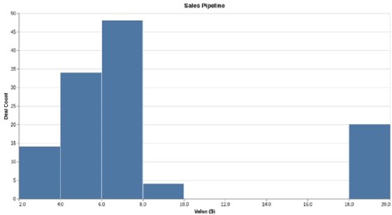
Daniel Chalef, vice president of data science at SparkPost, said histograms offer an effective way to visualize the distribution of the values in a data set, which may help users when analyzing the data. Averages are often misused and can be misleading, Chalef said. For example, the average deal size in a sales pipeline can be skewed by several large deals. To provide more accurate information, an analyst can use a histogram to show the number of deals within different price ranges, as in the example below.
Histograms look like bar charts, but they're specifically designed to illustrate data distribution. The equally sized numerical ranges that the data values get grouped into are called bins, some of which may not have bars if no data falls into those ranges. One potential issue with histograms is ensuring that the bins are properly sized to convey useful and relevant information.
Heatmaps
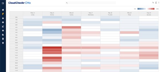
A heatmap uses color coding to show the magnitude of data elements in two dimensions. CloudCheckr's Davis said that can help his company's customers understand the temporal characteristics of their cloud infrastructure. For example, CloudCheckr uses heatmaps to visualize the use of cloud resources in different time periods so customers can see good times to shut off or downsize servers to reduce costs.
But Joshua Moore, principal technologist for cloud analytics at NetApp, said the heatmap is his least favorite visualization technique, at least in most situations he has seen it used. He often sees dozens or hundreds of key performance indicators (KPIs) on things like the operational health of servers tracked on a grid in one view, with all but a few of them showing as green.
"This just creates clutter and noise," Moore said. "The healthy KPIs require neither action nor attention, so why does anyone need to see them? Conditional formatting like this is best kept to a handful of top-level KPIs, not huge heatmaps."
Scatter plots
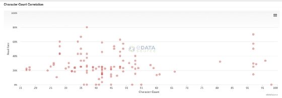
Scatter plots are useful to display the relative density of two dimensions of data. Well-designed ones quantify and correlate complex sets of data in an easy-to-read manner. "Often, these charts are used to discover trends and data, as much as they are to visualize the data," Adams said.
For example, the SparkPost scatter plot below enables digital marketers to correlate the number of characters in email subject lines with email read rates to help them identify best practices and plan future campaigns.
Knime's Tamagnini likes to use scatter plots to show relationships for single data points -- for such uses, they're easier to read and interpret than bar charts and other visualization techniques, he said. However, he added that scatter plots struggle when analysts try to display more than two dimensions. Also, packing too many data points into a scatter plot can make it hard to decipher.
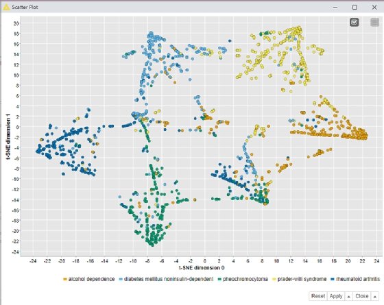
t-SNE
This technique, formally known as t-Distributed Stochastic Neighbor Embedding (t-SNE), uses a machine learning algorithm to model high-dimensional data sets as two- or three-dimensional data points for display in a scatter plot, using colors, shapes or other visual elements to represent the third dimension. It was developed to address some of the limitations of conventional scatter plots.
Data scientists tap t-SNE to transform relationships in the raw data so they're easier to visualize. "The adoption of data transformation techniques, like t-SNE, is the direct consequence of the increase in data literacy and data science expertise in the data visualization field," Tamagnini said.
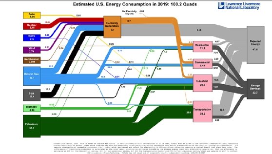
Sankey diagrams
Sankey diagrams represent data and process flows via lines and arrows with different widths that illustrate the magnitude of individual flows. SparkPost's Chalef said they're a "beautiful tool for illustrating flows in a network," using a directed graph that runs left to right.
A Sankey diagram can be visually overwhelming at first, West Monroe's Miller said. But it's a flexible visualization technique that can work even with massive fluctuations in the underlying data set, he added. For example, he has used it to visualize how applications move through a complicated, nonrigid workflow.
"A Sankey diagram is not easy to understand and requires explanation to the user in order to gain insights," Miller said. He recommended that designers include instructions or help text in a visualization or a dashboard where it's embedded, ideally in a hover-over information field.
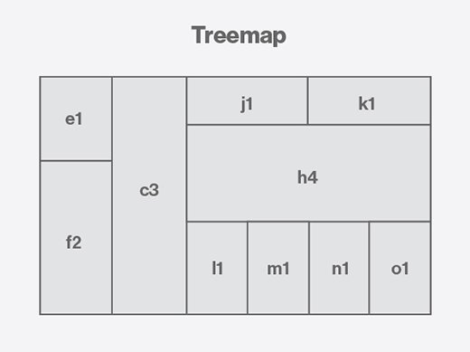
Treemaps
A treemap displays hierarchical data using nested blocks that are sized differently based on the data values they represent and can be packed into other blocks to show large data sets. For example, IT administrators often use treemaps to track the use of disk space, memory or CPU resources in systems. The blocks can help users identify data trends, although fluctuations in their sizing and how they're ordered are potential complications that visualization designers need to consider.
Davis said CloudCheckr has started experimenting with treemaps to visualize cloud security vulnerabilities based on the severity and scope of individual security issues. It can be hard to communicate the size and scale of a particular vulnerability to customers using other data visualization techniques, he said, adding that the treemaps show promise in helping users to understand the severity of the issue at hand and the level of urgency it requires.
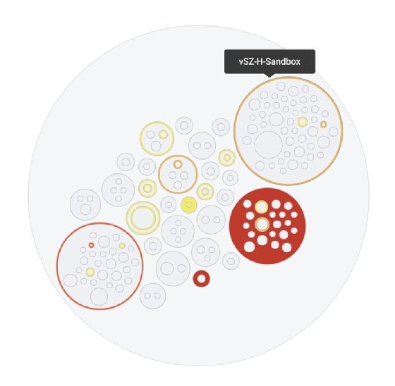
Circle packing charts
A circle packing chart is a treemap variation that use circles rather than blocks to represent the relationship among data objects. See Ho Ting, senior director of software engineering for CommScope's Ruckus line of networking products, said he finds them useful for showing an overview of a network and illustrating the severity of performance issues in different parts of the network.
Plotting different-sized circles within larger circles makes it easier to display network data three layers deep, including the overall network, the individual controllers and the different zones within each controller, Ting said. That provides a helicopter view of a network's health for a quick scan by users, plus deeper visibility into problems, he added.
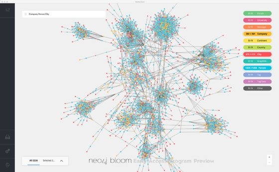
Network diagrams
A network diagram represents the way data elements are connected by showing nodes and the link lines between them. "Network diagrams help visualize data that is most hard to grasp without visualization," LatentView's Hariharan said. There are many examples: networks of friends and the strength of their relationships, data transmission between systems and devices, financial networks, disease propagation, transportation and people movement, criminal activity and more.
One of the challenges of designing a network diagram is deciding what to show and what to hide. "Many times, the default network diagram comes out like a ball of mud with no obvious patterns," Hariharan said. Designers need to include a mechanism to show the big picture and then progressively drill down and see more details as a user zooms in on the diagram, he advised.
Combined visualizations
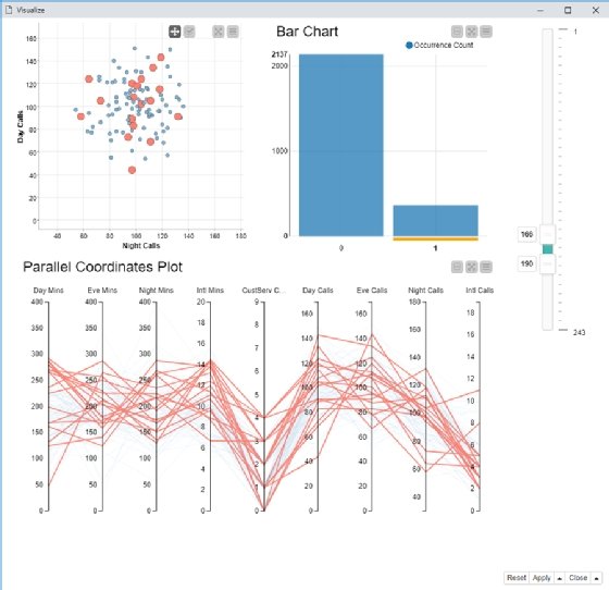
"Simple charts are powerful, but combining them together is even more powerful," Knime's Tamagnini said. For example, he combined a bar chart, a scatter plot and a parallel coordinates plot in a single dashboard, shown below, to provide a more detailed and interactive view of the underlying data for an analytics application to predict customer churn.
The combination of the three visualizations enables users to select all customers who churned or didn't churn by clicking on the associated column in the bar chart. Data on the selected group of customers is automatically displayed in the two plots so the users can compare numerical attributes to see whether there's a correlation between them and customer churn. It's an example of how the visual analytics mantra coined by UX and visualization pioneer Ben Shneiderman in 1996 can be applied to all sorts of data visualization techniques: "Overview first, zoom and filter, then details-on-demand."