
Getty Images
Checklist to create accessible Word documents
To better support employees and reach more customers, content teams should use this checklist to create accessible Word documents and learn key tips about alt text and font styles.

In modern businesses, employees primarily share and read documents electronically, so creating accessible documents can help organizations support all readers.
Accessible documents improve readability and usability for everyone, including those with lower visual acuity or who have visual or reading disabilities. Many of these readers use assistive technologies, like a screen reader that reads text aloud. Whether an organization aims to reach more customers or better support its employees, taking the steps to make a document more accessible can help create cleaner, more readable documents for everyone.
In this accessible Word document checklist, learn how to write inclusive content and enhance overall UX and readability for all readers.
1. Use proper headings
Headings help all readers, and particularly those using a screen reader, navigate through a document. Instead of simply changing font size and style, document authors can explore Word's built-in heading styles -- Heading 1, Heading 2, etc. -- to indicate the headings for each section. This helps users with assistive technology jump to different sections of the document with ease.
Take the following steps to apply heading styles in Word:
- Select the text that will serve as the heading.
- Go to the "Home" tab.
- Choose the desired heading style from the lists.

2. Use appropriate fonts
Accessible fonts play a key role in readability. Standard, commonly used fonts are best, as they are clear and legible. Often, experts recommend using sans-serif fonts, such as Arial, Verdana or Calibri, but some serif fonts -- such as Times New Roman or Palatino -- work as long as they are not too small.
Accessibility experts often recommend sans-serif fonts because the little flourishes at the ends of letters -- called serifs -- can make text harder to read for those with dyslexia. However, long paragraphs set in sans-serif can make for difficult reading, as well.
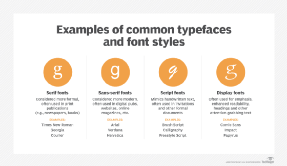
Regardless, content creators should use appropriate font sizes. Accessibility experts generally recommend a font size between 12 points and 16 points for body text, and 16 points or larger for section and document titles. Titles should always be larger than body text to communicate visually the hierarchy of the content.
As with headings, paragraph styles can make fonts consistent. Once users change the fonts for a paragraph, they can right-click the style and select "Update [style name] to Match Selection" to apply this setting to all the paragraphs that need the same style.
3. Adjust paragraph spacing
Good spacing between paragraphs aids readability and ensures the content does not appear dense and daunting. Line spacing of 1.5 is often the best for accessibility. Users can take these steps to modify paragraph spacing in Word:
- Right-click the selected text.
- Choose "Paragraph."
- Make edits to the "Spacing" section.
Indented body paragraphs do not need extra vertical space -- meaning to include an extra space after a paragraph. However, body paragraphs that are not indented need vertical space to indicate the paragraph break.
4. Include alt text for images
An accessible Word document checklist is incomplete without alt text. Alternative text, or alt text, is a brief description of an image within content. People using screen readers rely on alt text to convey the content or function of the visual elements or have it indicate if an image is purely decorative.
To add alt text to an image in a Word document, take the following steps:
- Right-click the image or object.
- Select "View Alt Text."
- Add a description in the "Alt Text" field.
5. Create accessible tables
Word lets users create complex tables with straddled columns or rows, but this can make them hard for a screen reader to describe. So, keep tables simple and without any straddling, if possible. Follow these tips to create an accessible table in Word:
- Include a header row.
- Avoid blank cells and use "N/A" instead.
- Add alt text, which can be found by right-clicking and selecting "Table Properties."
Additionally, users should never use an image of a table instead of using Word's table functionality.
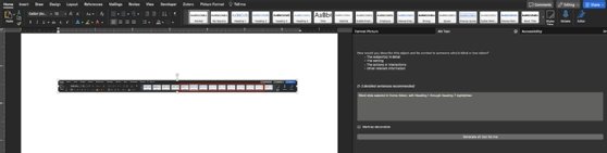
6. Run Word's accessibility checker
Word's built-in Accessibility Checker can spot potential accessibility issues. It gives a summary of errors, warnings and tips. To run the check, take these steps:
- Click on the "Review" tab.
- Click "Check Accessibility."
- Alternatively, select "Tools > Accessibility."
The Accessibility Checker highlights aspects of a document that might cause people with disabilities to struggle, and offers suggestions to fix these issues. For example, it can identify elements that lack alt text or suggest heading styles to create a better document structure.
Users can choose to keep this tool on and let it alert them of possible accessibility issues while they work. To do so, they can check the box that says "Keep accessibility checker running while I work."
Key takeaways
An accessible Word document goes beyond compliance with laws or guidelines. It also ensures everyone, regardless of abilities, can access, navigate and understand content. When writing in Word, users should consider how different people may interact with the document and keep in mind that a well-structured and accessible document benefits everyone.
Above all, organizations should allow open access to information, thus fostering an inclusive environment that values every individual's contribution. With this checklist, users can optimize Word documents for accessibility and promote a comprehensive understanding of their content for all users.
Jordan Jones is a writer versed in enterprise content management, component content management, web content management and video-on-demand technologies.