IoT data visualization: Tips and challenges
IoT data visualization can help organizations turn raw sensor data into business intelligence that drives innovation, but the process comes with its challenges and pitfalls.

IoT consists of a vast and rapidly growing array of devices in the environment. IoT sensors measure or record physical properties of phenomena, such as temperature, air pressure and electrical charge. IoT actuators modify the environment, for example, by turning on heat or air conditioning. IoT cameras capture pictures and videos, while IoT microphones pick up sounds. IoT GPS endpoints enable the pinpointing of a device's location. These connected devices are central to systems like smart factories or smart cities.
IoT devices can generate enormous amounts of data. Interpreting the data just by looking at columns of numbers in a spreadsheet can be slow and difficult. So, as with big data, people mainly interact with it through visualizations. People must be able to visualize IoT data to make informed decisions. Visualizing data helps humans identify patterns, such as a trucking company tracking trends in freezer trailer temperatures over time.
IoT data visualization: A process, not an action
Some practical knowledge can be gained from IoT networks through a one-time analysis of the data available. For instance, a tire manufacturer might learn a lot by analyzing tire temperature and pressure data for a specific plane's landing gear from the hours before a catastrophic tire failure.
However, it's typical for IoT data analysis to be ongoing, either continuous or cyclical. As long as a device isn't destroyed or taken offline, sensors and actuators will keep returning data, so analysis needs to be constant. For example, that tire maker might monitor a tire's status daily or after each flight. Therefore, IoT data visualization should be managed as an ongoing process, not a one-time task.
A data visualization process should be integrated with the organization's overall IoT architecture and data lifecycle management. The architecture should -- among other things -- define all the different data sources that can feed IoT analytics and visualization, as well as how they can communicate the data they collect. The data lifecycle should specify the characteristics of the database or data lake from which IoT data points can be pulled.
What is the process of data visualization in IoT?
The five phases of the IoT data visualization process are capture, preparation, modeling, visualization and interpretation.
- Capture. Sensors and actuators gather data on what they observe or report on their state. The data can be cached on the device until tapped by the network or collected in a controller within an edge data center, primary data center or cloud platform.
- Preparation. Data is aggregated from multiple devices, normalized as needed -- which might include adding metadata or synthetic data derived from the captured information -- and stored in a database or data lake.
- Modeling. Analysts decide which data to pull together and how to structure it for visualization. This includes determining which data points to incorporate into the visualized data set.
- Visualization. Depending on the model, different visualizations are prepared. This can be as simple as a scatterplot or as complex as a set of interrelated 3D projections of a complex 4D surface.
- Interpretation. Interpretation uses visualization to extract valuable knowledge from the data.
Key IoT data visualization best practices
Besides connecting a visualization process to a solid IoT architecture and data management lifecycle, some best practices to remember include the following:
Know the data
Analysts should understand the source of the data and its limitations when developing visualizations for IoT data sets. They should avoid making assumptions about its accuracy that aren't supported by the realities of the devices providing it.
For example, tire manufacturer analysts shouldn't create visualizations showing tire pressures to the ten-thousandth of a pascal if the sensors are only accurate to the hundredth. That could lead to interpretations based on no real data.
Know the audience
This is important for the clarity of the output. Audiences comfortable with tabular data might see a series of tables and simple graphs -- one for each passing second -- while audiences not familiar with tabular data might prefer an animation with a more complex, color-coded graphic that morphs over time.
Select the data to be visualized
This is about knowing the data, understanding the audience and grasping the broader context of the organization. Where possible, analysts should focus on key captured and interpolated synthetic data analyzed in a way that addresses defined KPIs and organizational objectives for reporting to executives and managers or for exploring important operational factors by technical audiences such as engineers, researchers or designers.
In the tire maker example, executives might want to see durability and failure data in a way that illustrates its effect on revenue and profits. In contrast, materials scientists and tire designers might want to examine other factors related to improving designs or formulations. Either group might wish to view such data with different filters: by tire type, tire age, plane type, airline or region.
Pitfalls and challenges of IoT data visualization
Of course, visualization teams also encounter many common problems, such as the following.
Data volume and velocity
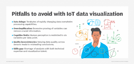
Many IoT deployments involve enormous amounts of data, and the data changes rapidly. For example, sensors on a jet engine might report on thousands of variables every millisecond, resulting in terabytes of data per flight.
Visualization processes can be challenged by the need to cycle through vast volumes of data in a valuable amount of time -- e.g., to process each day's data before it's time to process the next day's. The most challenging problem is meeting a need for data visualization in real time, displaying the visual representation of analyzed data within milliseconds of that data arriving.
Data oversimplification
The more complex the data sets are, the more difficult it becomes for analysts to create clear and engaging visualizations. As a result, they must prune variables whenever possible, but it's easy to cut too much and leave out important information.
Data overload
If analysts prune too little, the effect can be just as damaging. It's challenging for humans to associate more than a handful of variable values with a single data point on a chart.
Once the six easiest ones are used -- position, shape, color, brightness, surface pattern and size -- it gets harder to encode more information into the visual representation. That doesn't stop analysts from trying and pushing more information into the output than humans can make sense of.
Data source inconsistencies
It's common for data quality from a specific sensor, type of sensor or location to vary in reliability. Analysis and visualization processes can mask this variation if analysts don't carefully preserve and reflect it in the output, which increases the risk of making incorrect conclusions from the data.
Workforce skill gaps
All these problems highlight a major underlying issue: the challenge of finding, creating and retaining a team of analysts with the technical skills and talent for making visualizations.
Popular tools for IoT data visualization
Major visualization tools for working with IoT data run the gamut from the ubiquitous analytics workhorse of many organizations, the spreadsheet -- be it Excel, Google Sheets or something else -- to cloud-based big data analytics platforms explicitly designed to create powerful visualizations from large data sets.
Common platforms include Tableau and open source Grafana, as well as visualization components in IoT management platforms from providers like Oracle or AWS.
John Burke is CTO and a research analyst at Nemertes Research. Burke joined Nemertes in 2005 with nearly two decades of technology experience. He has worked at all levels of IT, including as an end-user support specialist, programmer, system administrator, database specialist, network administrator, network architect and systems architect.