
agsandrew - Fotolia
Associativity, graphical summary computations aid ML insights
Associativity computation and graphical summary computation allow for more complex insights, and in turn improve predictions. Explore how these ML techniques work in practice.
This article is excerpted from the course "Fundamental Machine Learning," part of the Machine Learning Specialist certification program from Arcitura Education. It is the fifth part of the 13-part series, "Using machine learning algorithms, practices and patterns."
Continuing from part four of the series, this next article introduces two more machine learning data exploration techniques: the associativity computation and the graphical summary computation. As explained in part four, these techniques are documented in a standard pattern profile format to ensure consistency.
Associativity computation: Overview
- How can the existence of relationship(s) between variables in a data set be determined?
- Problem. Gaining an understanding of a data set and the subsequent model development requires finding connections between variables. Failure to do so results in ineffective models comprising irrelevant variables as predictors.
- Solution. The connection between variables is expressed in the form of relationship between variables and is quantified via the application of proven statistical techniques.
- Application. Numerical values present in the data set are taken in pairs and the measures of association (correlation and covariance) are calculated.
Associativity computation: Explained
Problem
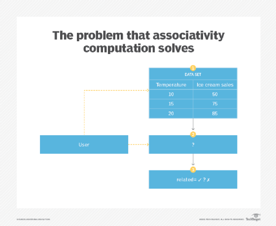
In a data set, there is generally a set of variables that influence each other in some shape or form. Where the application of central tendency computation and variability computation patterns allow for gaining insight on a single variable (univariate analysis), they do not provide information about how to draw intuitions about the aforementioned inter-variable dependencies (bivariate analysis). This is important in order to be able to choose the best predictors for a machine learning problem (Figure 1).
Solution
The inter-variable relationship is quantified by taking a pair of variables in turn, such that each variable is compared against the rest of the variables in the data set. This quantification results in a numerical value that can then be used to choose the variables with the strongest relationship. Normally, a variable of interest, such as a variable whose value needs to be predicted, is chosen and compared against other variables.
Application
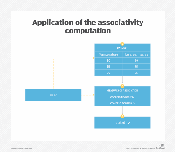
The measures of association quantify the relationship between two variables in a data set. The measures of association include correlation and covariance. Correlation is the degree of linear association between two variables, measured using a correlation coefficient. The relationship is considered to be linear when the scatter plot of the variables' values results in a straight line, which means that both variables change with the same proportion at a constant rate.
The strength of the correlation is the absolute value of the correlation coefficient and ranges from 0 to 1. The direction of the correlation is given by the sign of the coefficient. A negative sign indicates an inverse relationship, meaning as the values of one variable tend to increase, the values of the other variable decrease. A correlation coefficient near zero implies little or no correlation between the variables' values.
The presence of correlation does not constitute causation. Correlation only constitutes a mathematical association between the variables rather than a factual association. Regardless, the visualization of a scatterplot and the calculation of a correlation coefficient can provide useful insights about the data.
Pearson's product moment coefficient is one example of a commonly used correlation coefficient for measuring the correlation between two variables. Non-linear associations may also exist between variables, in which case Spearman's rank correlation can be used. However, a monotonic relationship must exist between the variables. A monotonic relationship is where one variable always either increases or decreases while the other may remain constant. Variables that first increase and then decrease or vice versa do not constitute such a monotonic relationship.
Both the Pearson and the Spearman correlation coefficients have a range of -1 to +1 and are interpreted in the same manner. The Pearson correlation coefficient is affected by outliers as it takes into account the actual magnitude of the values. Instead of using the values as is, the calculation of Spearman's correlation coefficient requires converting original values to ranked values. As a result, Spearman's correlation coefficient is not affected by outliers as the actual magnitude of the values is ignored.
Like correlation, covariance is a measure of how two variables change collectively. However, unlike correlation, its value can be any negative or positive number and is in the same units as the units of the variables. Unlike correlation, the value of covariance is dependent on the units used, meaning the covariance value for inches will be different from the covariance value for centimeters. However, the value of correlation is standardized and is not affected by the units used (Figure 2).
Graphical summary computation: Overview
- How can intuition about a data set be developed beyond computation of simple descriptive statistics?
- Generating descriptive statistics, such as numerical summaries, helps quantify various aspects of a data set. However, these techniques alone fail to capture any trends or patterns hidden in the data set that can be easily identified by humans.
- The trends and patterns hidden in a data set are identified by stimulating visual perception of humans through generating various charts.
- Various graphical summaries are generated from the data set, including bar chart, histogram, scatter plot, cross-tabulation, and box-and-whisker plot.
Graphical summary computation: Explained
Problem
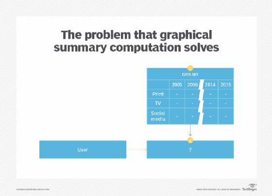
Generating descriptive statistics via the application of central tendency computation, variability computation and associativity computation patterns, while helpful, reduce the interpretation of the data down to a numerical value. In other words, such statistics on their own cannot become the basis for finding hidden patterns inside the data as they only highlight specific aspects of patterns. However, there are generally other characteristics of the data that the aforementioned statistics are unable to draw attention to. This particularly applies to situations where the scope of the problem being explored is not strictly defined or well understood (Figure 3).
Solution
Instead of only relying on numerical figures, the data can be summarized in a visual manner. This opens up the opportunities for looking at data from different perspectives in a subjective way, which can lead to the possibility of unearthing trends, patterns and anomalies.
Application
Graphical summaries of data are generated by creating various charts. This generally includes bar graphs, line graphs, scatter plots, histograms and box-and-whisker plots. These visualizations highlight different aspects of the data.
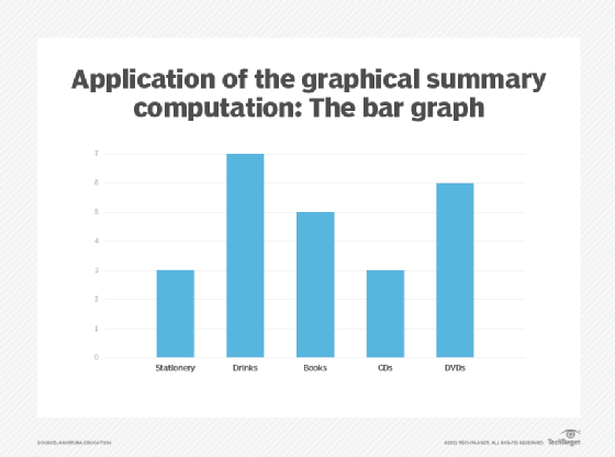
A bar graph, also known as bar chart, is a graph generally used to view values of discrete variables that can be ordinal or nominal, and can also be used to view discrete distributions. Each discrete value is represented as a category on the x-axis, while the y-axis is used to display the count of each category. The actual count is represented using a rectangle, called a bar, where its height shows the category count. There are generally gaps between each bar in a bar graph (Figure 4).
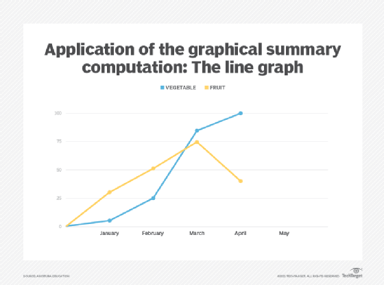
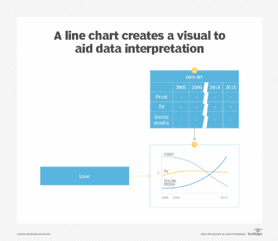
A line graph is a type of a bar graph used to display numerical ordinal data where, instead of using a bar, a single point is used to represent the value before all points are joined together using a line (Figure 5). Line graphs are often used to analyze data over time or trends, and should not be used to display nominal data like product categories. However, ordinal data related to multiple categories can be shown using a single line graph (Figure 9).
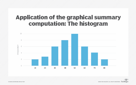
A histogram is like a bar graph in that it is used to view values of continuous variables that have been grouped into intervals. However, instead of viewing the frequency of a distribution in a tabular form, a histogram is often used to view a distribution in a graphical manner. Unlike a bar graph, there are no gaps between the bars. The height of each bar represents the frequency of the corresponding value, where the area of each bar is proportional to its frequency (Figure 6).
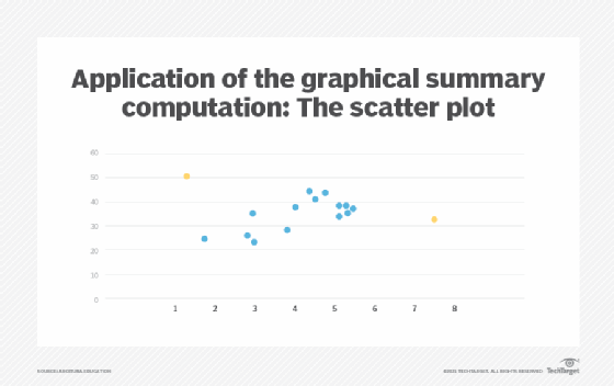
A scatter plot can be used to view the association between two variables to determine whether a pattern exists between the variables. It also offers a graphical means of spotting outliers. Generally, a scatter plot is used to plot variables for correlation and regression analysis. For regression analysis, the independent variable is plotted on the x-axis and the dependent variable on the y-axis. Each pair of values is generally marked by a cross or a dot on the graph. In Figure 7, black circles represent overlapping values and highlight the concentration of values, and red circles indicate outliers.
A box-and-whisker plot, also known as a box plot, can be used to display the median, range, Q1, Q3 and IQR of a distribution using just one type of a graph. The mean value can also be shown by adding a plus sign to the box (Figure 8).
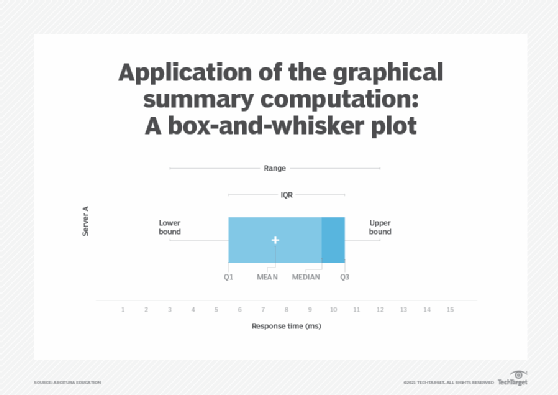
The box-and-whisker plot is the ideal visual analysis technique for comparing multiple distributions. The position of the box reveals whether the distribution is symmetrical or asymmetrical. A box positioned in the middle of the whiskers represents a symmetrical distribution. If the right whisker is longer than the left whisker, then the distribution is positively skewed and vice versa. Similarly, if the median is greater than the mean then the distribution is negatively skewed and vice versa.
Outliers can also be identified, as the presence of outliers makes the whiskers longer (Figure 9).
What's next?
In the next article, we will explore the feature selection and feature extraction data reduction patterns.
View the full series
This lesson is one in a 13-part series on using machine learning algorithms, practices and patterns. Click the titles below to read the other available lessons.
Lesson 1: Introduction to using machine learning
Lesson 2: The "supervised" approach to machine learning
Lesson 3: Unsupervised machine learning: Dealing with unknown data
Lesson 4: Common ML patterns: central tendency and variability
Lesson 5
Lesson 6: How feature selection, extraction improve ML predictions
Lesson 7: 2 data-wrangling techniques for better machine learning
Lesson 8: Wrangling data with feature discretization, standardization
Lesson 9: 2 supervised learning techniques that aid value predictions
Lesson 10:Discover 2 unsupervised techniques that help categorize data
Lesson 11: ML model optimization with ensemble learning, retraining
Lesson 12: 3 ways to evaluate and improve machine learning models
Lesson 13: Model optimization methods to cut latency, adapt to new data