skeuomorphism
What is skeuomorphism?
Skeuomorphism is when something is designed with extra ornamentation to make it resemble another object so it is more familiar. The term is most used in user interface (UI) and user experience (UX) designs to add real-world design cues to virtual objects to make them easier to understand. Adding purely skeuomorphic elements has fallen out of style, but using small real-world design clues to help users can still be good practice.
It is thought that by using real-world elements and design cues in a digital interface it will be more easily understood and readily used. For example, adding shading and a glossy finish to an icon will give it the appearance of a raised button, inviting the user to click it. Another example of skeuomorphism would be an e-book reading app with a digital bookshelf, page turning animation and a paper texture background.

Skeuomorph comes from the Greek skeuos (meaning container or tool), and morphê (meaning shape).
Pros and cons of skeuomorphism
There are many factors to weigh when considering skeuomorphism in a design. Quite often, some level of skeuomorphism is desirable, but using too much will detract from usability.
Adding skeuomorphic elements can increase an end user's familiarity with a UI. They can carry over their knowledge of how a real-world item operates and apply it to the UI. This can make it more inviting to new users or people who are not familiar with digital interfaces. For example, instead of an on/off slider, a graphic of a light switch in the on or off position is shown to indicate the function's status and that the user clicks it to toggle.
Some interfaces take skeuomorphism to the extreme of entirely recreating the physical control panel of equipment. This is especially popular with audio software that mimics the designs of rackmount audio processors or effects, sometimes including audio jack plugboards to represent the processing path. Some specialized equipment software might also be designed to replicate the physical controls. This can be helpful when the expected end user has decades of experience with physical controls that they can then directly translate to the new digital ones.
Most designers these days reject skeuomorphic design though. It often adds unnecessary detail to the UI. This can range from simply making the interface look cluttered or messy to harming usability, such as if text legibility were to be affected.
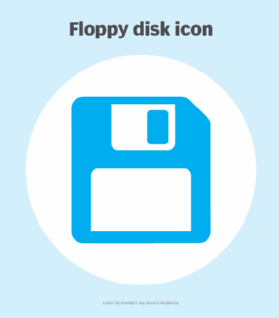
As people have become more accustomed to digital interfaces, the need to include skeuomorphic elements has lessened. Some users might never have even interacted with the physical object that the design is trying to replicate. For instance, most smartphone users have never handled a floppy disk, so using one as a save icon could lead to confusion for some.

Most designers have settled on a combination of flat design with some skeuomorphic elements to help understandability. Generally, skeuomorphic elements should be added only when they add to the usability of the design. They should not be used for purely aesthetic reasons. Google's Material Design is an excellent example of a generally flat design that uses consistent and logical skeuomorphic flourishes.
History of skeuomorphism
The term skeuomorphism has been used since at least 1890, but the practice of making a new object to imitate an old one has been done for millennia. Some early examples include pottery with design elements of silver cups or ancient Greek stone temples with carved details that are thought to mimic wooden structures. More modern inventions also followed this trend with early electric lights imitating candlesticks and gas lamps, or early automobiles using horse carriage designs.
Skeuomorphism in the digital era
The invention of the graphical user interface (GUI) necessitated the creation of new user interaction paradigms that weren't needed with text-only interfaces. Skeuomorphism was employed to help people understand these new interfaces easier. Some examples of early developments are the desktop metaphor with papers and tools placed on it and a trash can that bulges when it is full and needs to be emptied.
Don Norman is an academic that was influential during this time and popularized user-centric design in UIs. He proposed that the designer can make an interface immediately understandable to the end user through design cues.

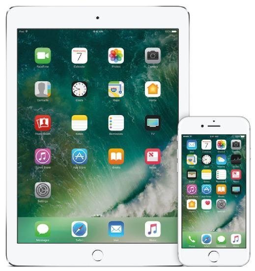
Steve Jobs at Apple was another proponent of skeuomorphic design to improve usability and friendliness to the user. Skeuomorphism arguably reached its peak in the early versions of iOS used on the first iPhones and iPads. These famously went so far as to include the appearance of handstitched leather on the contacts app to imitate a leather notebook. It was also during this time that Windows Vista used its Aero interface to imitate panes of glass and widgets on the desktop.

When skeuomorphism got flattened
Flat design aesthetic began to take hold in the early 2010s. Windows Phone and later Windows 8 presented a tile-based flat design. While these operating systems were not commercial successes, the bold designs attracted attention.
About this time, the chief design role at Apple shifted from Steve Jobs to Jonathan Ive, who preferred a cleaner, less ornamented visual style. This shift was cemented in 2013 with the release of iOS 7.
Flat design was not without pitfalls though. Completely unornamented UI offered no indication with which what elements could be interacted. Still, flat design became the dominant trend in the latter half of the 2010s.

The rapid rise and fall of neumorphism
Neumorphism (sometimes neomorphism) sought to combine flat design with skeuomorphism. It combines simple and clean UI elements with drop shadows and other skeuomorphic elements to create a "fresh" and "modern" style. Web and app designers quickly adopted neumorphism in 2020. Apple also reintroduced many skeuomorphic elements into macOS with the 2020 Big Sur version and iOS 14.
Neumorphism quickly came under fire, however. While the designs were often beautiful, they added unnecessary complexity and ornamentation to the UI. Neumorphism also does not necessarily improve usability. The heavy use of drop shadows and monochromatic or low contrast elements also affected accessibility for some users. It might also require additional processing power to implement and greater attention to detail by the designer.
Explore app interface design principles all developers should know and learn why it's important to know the differences between UX versus UI design. Check out four UX analysis methods that ensure optimal user experiences.
